this northern boy

Illustrations for an imaginary age

Tag: books

About Kickstarter

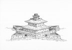
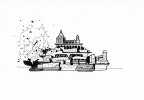
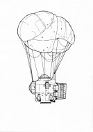
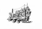
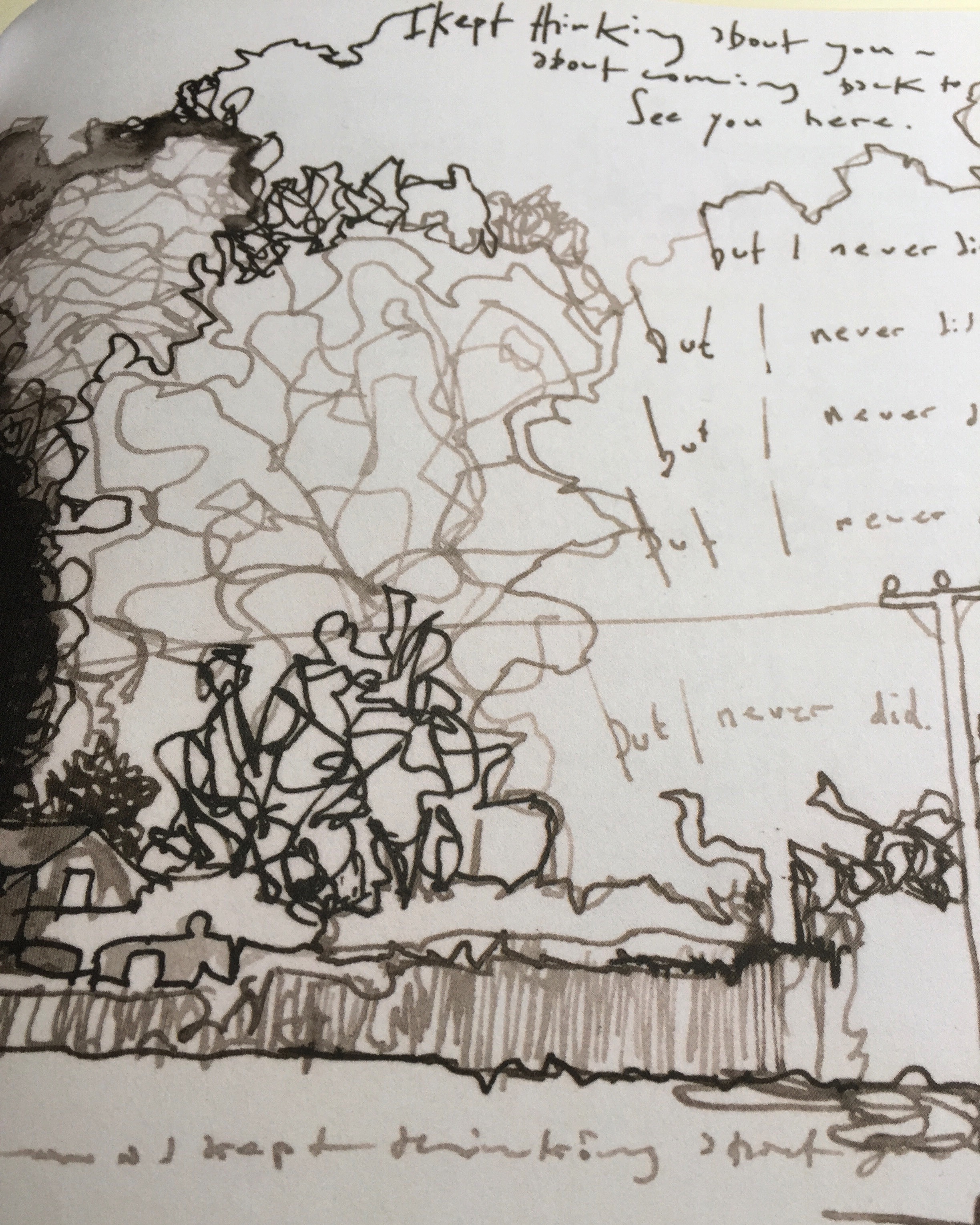
I’m currently working on my Innsmouth story, and debating what form the final ‘thing’ may take. It’s being written directly to twitter, and also catalogued here in a regularly updated blog post. I do want it to be a physical product at some point. My initial thoughts were that I’d publish each chapter in a little book. Nothing fancy, just an A5, stapled, two colour book, printed on uncoated stock. Maybe collect all the chapters together in a slipcase at some point along with some prints or postcards. Sounds pretty nice I think? As I’ve been writing more and more of the story, I’m also thinking that perhaps, maybe, it’s becoming and actual book. The kind of thing I’d approach publishers about. That’s maybe a bit further down the line though.

You can follow the Innsmouth story on Twitter, or here on the blog.

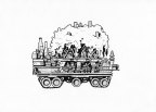
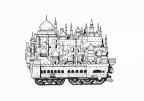
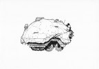
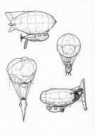
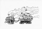
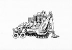
In the meantime, while thinking about how or what to produce, I got to thinking about Kickstarter as a funding avenue for it, and it struck me that I’d never shared the stats from my last project. My Weird Field World book, surpassed all my wildest predictions. I set the funding goal high enough to cover all my costs if I sold 150 books. In the end I sold 800 exactly through Kickstarter, while having enough funds to order a couple of hundred extra copies that I sold through my store. I really enjoyed the process of crowdfunding, and Kickstarter was a pretty simple but powerful platform for it.

So here are some stats about the campaign. Nothing particularly scientific, but interesting – particularly if you have any thoughts about running a campaign of your own.

Original funding goal – £2500

Final total – £32102 

Backers 900 (ten withdrew after the campaign ended)

Initial goal reached in just 36 minutes.

527% funded in 24 hours. 

Average pledge – £35.67

34% of backers came from Twitter.

Just 4.5% from Instagram and 2.4% from Facebook.

8.5% organically through Kickstarter.

8% of backers went for a digital download of the book

57% went for just the physical book

33% went for book plus other rewards

36% of backers were from the UK

28% from the USA

4.25% from France

3.6% from Canada

2% from Germany, Australia and the Netherlands.

Furthest a book travelled – 11,659 miles to New Zealand

And least travelled – less than a mile.

US states with most orders – California 41, Texas 23, Washington 19, New York 15, Illinois 13.

US states with zero orders – Alabama, Arkansas, Delaware, Idaho, Montana, Nebraska, N Dakota, Rhode Island, S Carolina, S Dakota, W Virginia, Wyoming.

If you’re thinking of running a Kickstarter I would highly recommend it, and if you have any questions – feel free to ask.

Rob

You can find prints of my work here

I also have a Patreon page

And you can find more of my work online…
Twitter
Instagram

Mastodon
Gumroad
Facebook

Tumblr

Buy Me a Coffee at ko-fi.com

Off the radar

Hi all, apologies for the lack of blog posts in the last few months. I’ve become a little disillusioned with social media lately and that’s meant I haven’t been posting content as frequently. I’m not sure if that’ll change too much, algorithms and the like are taking a bit of the joy out of it. When you post something and it gets half the engagement a similar post was getting a couple of years ago, despite having more than twice the number of followers, it’s a bit discouraging.

Anyway, here’s what I have been up to since summer.

Patreon. I’ve continued to work on my Patreon project – Weird Field World. There’s a bit of info about it here. I’m really enjoying fleshing out the world, adding background, history, little stories and characters. The engagement with my supporters there is great, and it’s very energising to have people to discuss the project with. You can support me here.

Inktober. I failed to finish Inktober this year. I think I just ran out of steam and enthusiasm for the project after a couple of weeks. My plan was to draw a series of little building based, loosely, on the play Under Milk Wood, by Dylan Thomas. I started off OK, but there wasn’t, perhaps, quite enough to go on for a whole month of building drawings. I think I managed 14 or 15 in the end. I was reasonably happy with most of them, and I might add one or two more at some point. A bunch of the illustrations are available to buy, so I’ll add a separate post soon.

Illustration work. This year has been a disappointment compared to last year. Working on a couple of books, plus work in a couple of magazines, some t-shirt designs and a little concept art work meant that 2018 was by far my best year for paid illustration work. 2019 by comparison has been awful. I’ve had a steady flow of private commissions this year, but no major commercial work at all. I’ve worked on concept art for a couple of clients, but both of those projects fizzled out due to publishing or financial issues. It has made me realise that I need to be much more proactive in seeking work, so in the last few weeks I’ve been getting organised. The year has ended brighter, a few little commercial projects have come in over the last two weeks, and I’ve had enquiries about a couple more.

Digital Illustration. A year or so ago I bought myself an iPad Pro and Apple Pencil, hoping to dive in to the world of digital illustration. One of the main reasons for doing so was to be able to produce super clean linework that would reproduce well in print. I have found working digitally a huge, and difficult, leap. The simple act of drawing on something other than paper, even with a matt screen protector on the iPad, has taken a huge amount of time to get used to – and there were many times when I thought it simply wasn’t going to be possible for me. The turning point was a suggestion from Rob McCallum on Twitter that I simply give up working on paper for a while, and only sketch on the iPad. It might seem like an obvious solution, but to draw digitally, and not get the results you want, for even a day was quite a task for me. Gradually, over the course of a couple of weeks things began to feel more natural. I got used to the feel of the stylus on glass, to the way digital lines worked, how to tweak brush settings to suit my way of drawing. Now, although I still have huge amounts to learn, I really do feel comfortable working on the iPad. I even enjoy it. Part of that is down to just how good the iPad and Pencil are, and how great a piece of software Procreate is. Together they are really quite formidable. Adobe and Wacom should be worried, particularly with the lacklustre release of Photoshop for iPad.

Parklife. I’ve continued to get out for walks as often as I can, if not as often as I’d like, in Bushy Park. Getting out in to the fresh air, and out in the open is hugely important for me, particularly if I’ve been stuck at my desk for a few days. I still get a thrill from seeing the variety of wildlife in the park – Red and Fallow deer, woodpeckers, kingfishers, and a huge number of other different bird species. I can’t recommend getting out in to the countryside enough. Make the effort if you can, you won’t regret it.

Reading. I’ve struggled to find moments to read this year. Not commuting in to London at all has been one factor – the only good thing about a three hour commute each day is that it gives you three guilt-free hours to read each day. Apart from that I just don’t seem to have been in the right frame of mind. Perhaps it’s a feeling of guilt – spending time reading when ideally I’d be working – even if I haven’t had the work to do this year. I’ve tried to put things right in the last month or so. I read and thoroughly enjoyed Gareth Powell’s sequel to Embers of WarFleet of Knives. And Ann Leckie’s Provenance, set in the Imperial Radch universe she introduced us to in Ancillary Justice, was a great read. Currently I’m reading Wilding by the appropriately named Isabella Tree. It’s the story of how she and her (affluent) family set about rewilding large parts of their 1400 acre estate in Sussex.

That’s it for now. I’ll do my best to post more often. Do let me know if there’s anything in particular you’d like me to write about.


You can find prints of my work here

I also have a Patreon page

And you can find more of my work online…
Twitter
Instagram
Facebook
Tumblr

Buy Me a Coffee at ko-fi.com

Mortal Engines: Original Art Sale

If you’ve read my earlier post you’ll know that I worked on The Illustrated Guide to Mortal Engines during the summer. Now that the book is out, and the film has had its world premiere, I thought it would be good to make some of my original drawings available to buy.

The illustrations below all feature in the book, and are hand drawn in ink on cartridge paper. The size of the illustrations, and in some cases the paper varies as multiple illustrations were sometimes drawn on a single sheet. If you are interested in buying an illustration then you can message me on Twitter or Instagram, or drop me an email – rob [at] thisnorthernboy [dot] co [dot] uk

Please note: © Rob Turpin, 2018. These original artworks may not be reproduced in any way without the prior written permission of Scholastic Limited. All rights reserved.

I’m happy to answer any questions you have about the illustrations.


Mortal Engines

I was asked earlier this year to work on some illustrations for The Illustrated World of Mortal Engines. The book is a visual guide of the world of Traction Cities, created by the author Philip Reeve, and written by Philip and Jeremy Levett. If you don’t know about Traction Cities, you should definitely check out Philip’s books. They’re a fantastic mix of science fiction, fantasy and steampunk.

The Illustrated World has work from seven different artists (including me, which I have to keep pinching myself to believe), and has been beautifully put together by Jamie Gregory over at Scholastic UK. The book, underneath its dust cover, is a beautiful, vibrant orange, embossed with a lovely motif of gears and cogs.

Philip and Jeremy have written a great A-Z of the book, which gives you a very good idea of the content.

The other artists in the book are: Aedel Fakhrie, Ian McQue, Maxime Plasse, Philip Varbanov, David Wyatt, and Amir Zand. I’ve been a massive fan of Ian and Amir’s work for bloody ages, and the other artists work a revelation! To be in the same book as them all is a huge honour.

You can buy the book here.


All my illustrations are drawn with Copic SP Multiliners, Rotring Tikky, and Kuretake No.8 Brush Pen. Initial sketches are done with Palomino Blackwings and a Pentel Graphgear Mechanical Pencil.


You can find prints of my work here

I also have a Patreon page

And you can find more of my work online…
Twitter
Instagram
Facebook
Tumblr

Buy Me a Coffee at ko-fi.com


Quiet, but not idle.

Well, I’ve been a bit quiet lately, sorry. I haven’t been idle though, I’ve been busy working on a couple of illustration projects.

I’ve just completed a tutorial for 3DTotal publishing. They have a new book coming out – Beginner’s Guide to Sketching: Robots, Vehicles & Sci-fi Concepts, and I was delighted to be asked to contribute a walk through of how I’d illustrate a sci-fi habitat in my isometric style. The book isn’t out until February next year, but you can pre-order it here.

The project that’s kept me very busy for the last couple of months has been a real thrill. Jamie Gregory, head of design at Scholastic UK, asked me if I’d be happy to do some illustrations for a new visual guide to the world of Philip Reeve’s Mortal Engines books. The book is to be an encyclopaedia of all the incredible things to be found in Philip’s books – the first of which is being turned in to a film by Peter Jackson. Other artists working on the book include Ian McQue and Amir Zand – both artists whose work I absolutely adore.

If you haven’t read any of Philip’s books – you really should have a look.
The description for Mortal Engines –

In a dangerous future, huge motorized cities hunt, attack and fight each other for survival. As London pursues a small town, young apprentice Tom is flung out into the wastelands, where a terrifying cyborg begins to hunt him down. MORTAL ENGINES launched Philip Reeve’s brilliantly-imagined creation, the world of the Traction Era, where mobile cities fight for survival in a post-apocalyptic future.

You can buy Mortal Engines here.

You can pre-order the Illustrated World of Mortal Engines here.

IWOME

The trailer for the film looks pretty bloody brilliant too.


You can buy prints of my work here

And you can find more of my work online…
Twitter
Instagram
Facebook
Tumblr


Inspiration Monday

I’m going to start blogging every Monday about what inspires me as an illustrator. It could be about other artists, science, a book I’ve read. Whatever it is that makes me want to pick up a pencil and draw.

Recent book haul

I’m starting today with a very bookish blog post, featuring some titles I’ve got over the last month or so. In no particular order –

One. Lead Poisoning – The Pencil Art of Geof Darrow
Geof Darrow is a comic artist from the US, best known for his work on Hard Boiled and Shaolin Cowboy (see Two). Darrow’s work is incredibly richly detailed, it’s actually hard to describe just how much work he puts in to each image. He’s also an incredible draftsman, with a real knowledge of how things look – whether that’s people, zombies, machinery, creatures, or architecture – Geof’s drawings are always believable – no matter how unbelievable the subject. Lead Poisoning is a fantastic insight in to the world of Geof Darrow, just prepare to be astounded.

IMG_3366

Two. The Shaolin Cowboy: Shemp Buffet – by Geof Darrow.
The Shaolin Cowboy is a character created by Geof Darrow in 2005. The title character is an unnamed former Shaolin monk on the road with a bounty on his head. This book is almost without any words at all, and instead it’s pretty much one extended fight scene between the – dual chainsaw wielding – Shaolin Cowboy and a horde of zombies. When I say it’s an extended fight scene, I really mean that. There’s a 99 page section of monk vs zombie, with only a single word uttered. It is audacious and unrelenting and it only works because Darrow’s art is so spectacularly detailed and inventive. I’m not sure any other comic artist could have pulled it off. Colour on this book is by the supremely talented Dave Stewart – most famous for his work on Mike Mignola’s Hellboy, and lettering is by Peter Doherty – who I’m sure would admit didn’t have the trickiest job on this particular book.

Three. The Collector by Sergio Toppi.
I’m pretty new to Sergio Toppi, not really looking at any of his work until I was already in my forties. I would have loved his books as a teenager, but there’s no way I would have appreciated his art to the same degree. Sergio Toppi was a Milanese artist born in 1932, he began his career as an editorial and advertising illustrator, but really made his name as a comic artist beginning in the mid 60s.
The Collector is series of tales about a mysterious collector of artefacts from around the world. Set against the backdrop of 19th Century colonialism, the book’s locations include the American West, East Africa, Romania, New Zealand… Toppi creates every place and character with a masterly array of linework, textures, and patterns. His style is almost dizzying, a kind of controlled chaos – all structured with fantastic fundamental drawing skills. The thing about Toppi that continually blows me away though is his composition. He creates images from images. Negative space giving his illustrations light and freedom, which compliments his intricate pen work perfectly. Like Mike Mignola, Sergio Toppi is a master at using dark and light, super high contrast making his images even more dynamic. I don’t think he has an equal when it comes to composing or framing an image. The Collector is entirely illustrated in black and white, and it looks magnificent.

Four. Sharaz-De, Tales from the Arabian Nights – by Sergio Toppi.
Sergio Toppi’s take on the Arabian Nights. Whereas The Collector is entirely black and white, Sharaz-De is punctuated by beautiful colour sections. Toppi’s colours add another mysterious, magical layer to his linework with a palette of blues and greens or pinks and oranges. No where does the colour subsume the ink though. Toppi’s drawings still sing out from every page, his composition and inventive panelling brilliantly evident.

Five. I Wonder What I’m Thinking About – by Moose Allain.
Moose Allain is a twitter phenomenon. He’s also an incredibly prolific artist, cartoonist, writer, poet, and all around charming human. With a background in architecture Moose now creates wonderful worlds of cartoon figures and beasts, buildings and cities, all wrapped up in a sense of playfulness and wonder. His book – I Wonder What I’m Thinking About is a gorgeously produced (via Unbound) collection of his writing and art. The content varies from cartoons to watercolours, from poems to prose, from wordplay to jokes. It’s really quite a hard book to describe, so I just suggest you check out Moose on Twitter and then pick yourself up a copy.
Of all the books featured in this blog post, it’s Moose’s that most makes me want to pick up a pen or pencil and create something. There’s a love of life and a joy that shines through all of Moose’s work, and it’s infectious.

See you next Monday with another post of artistic inspiration.

You can find more of my own work online…
Twitter
Instagram
Facebook
Tumblr

SaveSaveSaveSave

August blogfest – day 28

Everything I know about art (or did at the age of 15)

When I was a kid my mum enrolled on an Open University Course in the History of Art. One of the books that appeared on the bookshelves as a result was E.H. Gombrich’s The Story of Art. For a good eight or nine years, pretty much everything I knew about art came out of that book. My current copy is the third I’ve owned, and it’s still pretty indispensable.

IMG_7438

The Story of Art, first published in 1950 (and updated regularly since) is a fantastic introduction to the world of art, from prehistoric cave paintings to modern art, Gombrich discusses the development or art, painting, sculpture, and architecture. It really is an invaluable resource – even in the age of the internet, and if you want to learn something about art, particularly in a broad sense, it’s hard to beat.

For me the Story of Art was a real introduction to renaissance art – BerniniTitian, Bellini, Bosch, Van Eyck, Dürer, Holbein… The first time I saw many of the works of these artists was in the book, and it wasn’t until decades later I saw some of them in real life.

Years later when I was studying Art A Level, my teacher would read sections of The Story of Art to us, I think this was the history of art element of the A Level in its entirety. The thing was the teacher wasn’t really very good at pronunciation – so when she was reading sections on classical art, it was kind of hilarious. Heracles, became Herrackles, Hermes became Herms, Praxiteles became Pracsittles… Some things are just beyond the scope of Gombrich’s influence it seems.


August blogfest – day 8

In the post today I received  a copy of Jeffrey Alan Love‘s Notes from the Shadowed City.

What a book. If you don’t know Jeffrey’s work have a look at his website – he creates incredibly bold, silhouette images of beautifully textured ink, occasionally there’s a dash of red, but for the most part they are black and white.

The book is the travelogue of a young man in search of magical swords. 70 pages of gorgeous illustrations and hand-written text make this an absolute visual feast.

I’m glad I pre-ordered as it meant my copy came with an original illustration and a signed numbered print. I really can’t recommend this enough. Stunning.

August blogfest – day 6

Every week, usually at about 7.30pm on a Thursday, I Skype my friend – and fellow designer – Jon Elliman, and we record a podcast.

North v South, a podcast about but not about design, has now reached episode 24, and I bloody love doing the show with Jon. You can read a little about how and why we started the podcast here.

Episode 24 was probably my favourite yet. We had a book of the month – In Praise of Shadows by Jun Ichiro Tanizaki – that Jon and I both really enjoyed reading, and I think that comes through in our discussion. As always we end the show with a pie review – Jon and I both eating pies live on air, discussing their respective merits and scoring them out of ten, usually washed down with a beer. This week one of our listeners, Stuart Weston, sent me a pie to review. I say sent, actually his wife Kate hand delivered it! That’s the standard of listener we want more of!

If you’d like to listen to the show, it’s on iTunes and Soundcloud.

Every week (since episode 9) Jon and I take it in turns to design a new image for the new episode. Here are a few recent ones.

This week…

A little update. This week I’ve been working on tattoo commissions, fitting in a little freelance graphic design work on an island in the middle of the Thames, and drooling over the latest goodness from Aaron James Draplin and Field Notes Brand.

The tattoo design is for a guy in California who’d like a cutaway drawing of a lighthouse, featuring his young daughter looking out to sea from the top. Lots of fun drawing this.

If you don’t already know the work of Aaron James Draplin and the DDC go check out his website, and have a look on YouTube for some of Aaron’s videos. He’s a great designer who is absolutely bursting with enthusiasm and down-to-earth wisdom. His new book, Pretty Much Everything, is a joy to read, stuffed full of great content covering Aaron’s career to date. The cover is a beautiful textured, embossed design showcasing some of the many logos that have come out of the DDC over the years.

IMG_5721

I’ve been a fan of Field Notes for a long time, but I’ve only just subscribed to their quarterly editions. It’s a great way to make sure you get hold of the lovely limited editions notebooks they produce. When you subscribe you get a great little bonus with your first delivery – a couple of packs of their classic notebooks, a pencil, pen… Lovely.

IMG_5954