Guest post: Alex Connolly
This is the fourth guest post on this blog, and it’s the most unexpected. Previous guest posts have generally been about the quest author’s work – art, process, methods etc. That’s what I was expecting when I asked Alex to write me something. In an unnecessary show of modesty, Alex decided to not write about himself or his work, but of something much deeper. It’s very good. And you should definitely read his post below, but first, as Alex is too modest, I’ll sing his praises here.
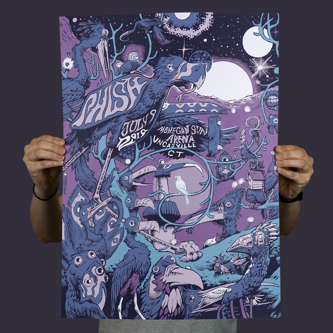
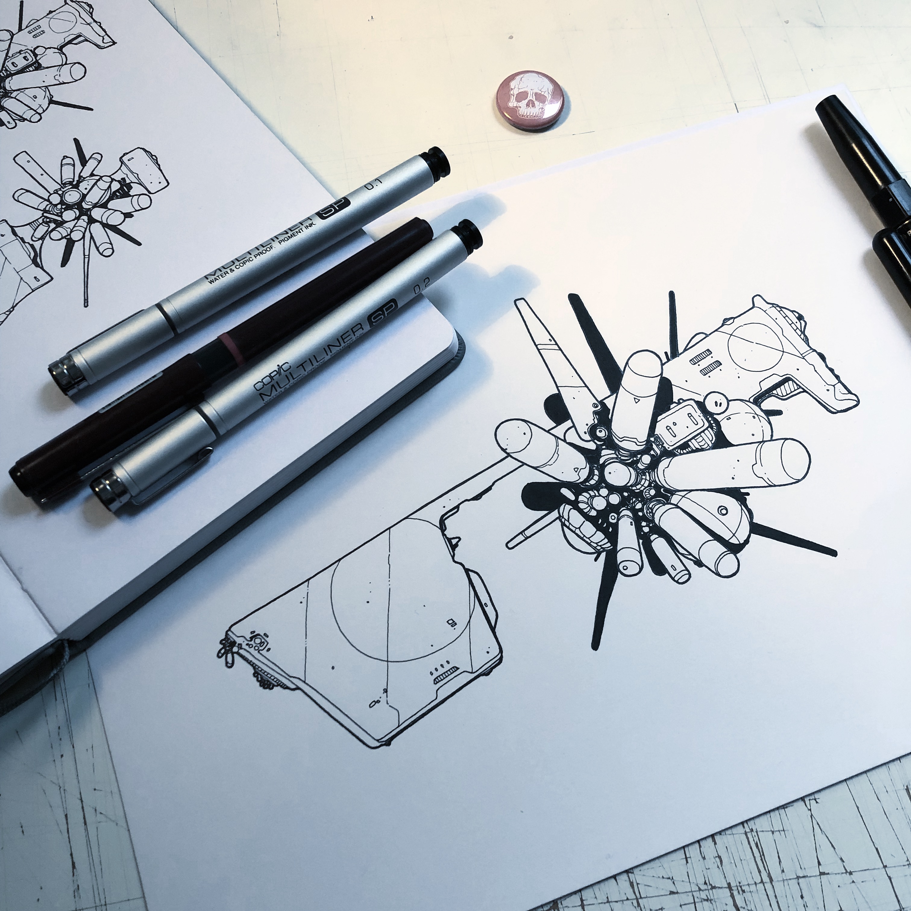
Alex Connolly is an Australian designer and illustrator, living in southern Japan. He’s worked for Neill Blomkamp (director of District 9, Elysium and Chappie), Marvel (I don’t need to add anything here do I?) and Double Damage Games. I first saw his personal work and was blown away. Alex produces incredibly technical mechanical sci fi illustrations. Incredibly designed, but perfectly believable. Check out Alex’s work on his website and twitter.


And now, for Alex…
•
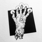
Ember in the Palm
First of all, I want to thank Rob for the opportunity to write for his esteemed blog.
Our creative agency, while not exclusive to, would be a lot different if it weren’t for the strange and dexterous marvels known as the human hand. No sooner free from the constraints of quadrupedalism, our ancient forebears took to all manner of evolutionary endeavours. Fast forward beyond the adaptive wonders of our Homo habilis ‘Handy Man’ origins, and we arrive not just at the mechanical deftness of our closer relatives, but breakthroughs in creative cognition.
In three parts, I want to select particular moments in the history of visual communication that celebrate the hand as a creative constant through time. These are not necessarily definitive, more personal picks from a smorgasbord of creative pursuits as we tumble through time.
The first part deals in the very definition of a touchstone.
Turning Point I – Wonderwall
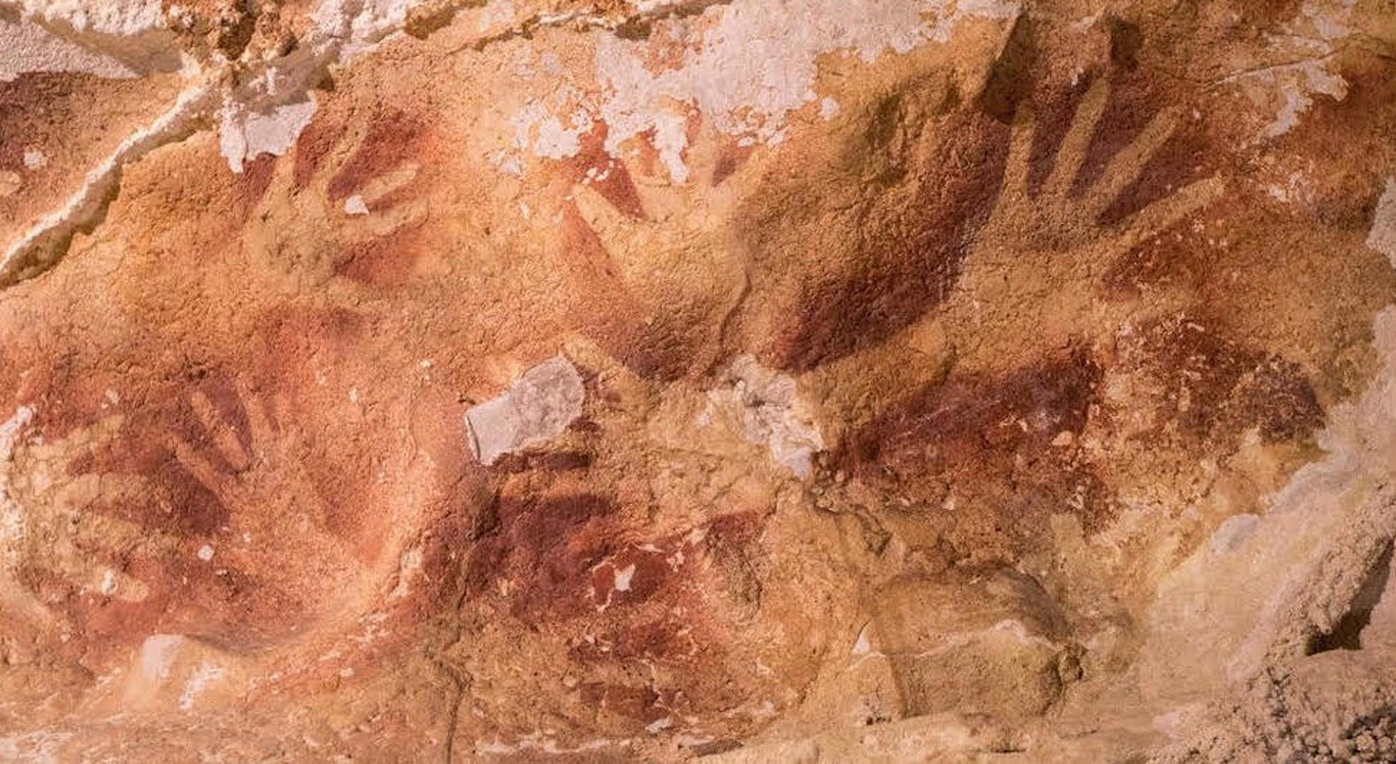
Parietal art or ‘rock art’ can be traced almost 40,000 years into prehistory. It is a strong visual demarcation that helps to define our ancestors as not just reactive wanderers, but as possessing an intrinsic creative drive to reflect and record. Naturally, given our physiology and biological perspective, it stands to reason hands feature as some of the oldest rock art in existence. These are our most practical tools; our dexterous and articulated arguably as important as the brains that operate them.
As such, the oldest rock art currently recorded are hand prints. Two particular locations featuring these antediluvian artworks are the El Castillo cave paintings in Spain and on the Indonesian island of Sulawesi, dated to 39,000 BCE and 37,900 BCE respectively. There has been some speculation as to which species of early human was first to be artistically inclined for its own sake. Conjecture has yet to prove whether Neanderthals committed to stone art in the same way as Homo sapiens, but it is understood that the latter were responsible for both El Castillo and the Liang Timpuseng artworks.
Both locations were used by early humans as shelters for generations, featuring an array of figurative and symbolic artwork across hundreds, perhaps even thousands of years. Hand art, a form dominated by negative space, has the artist — a shaman or perhaps a leader — place their palm against the rock face and spray ochre or some other form of intentionally-selected stain via their mouth or through a hollowed bone or reed. Theories as to meaning suggest anything from ritual to merely an act of self-actualisation, from ownership to leadership.
In the end, all share intent. Marking a moment in time in communal space, iconography that is not merely acknowledged by the artist’s contemporaries, but by generations thereafter. Ancestors such as Australopithecus garhi and Homo habilis are often associated by their primitive tool creation and usage, but said usage was largely survival-oriented. In the case of parietal art, it speaks to complex preparation such as the gathering and production of medium, and the conscious capacity to undertake an act that does not directly translate to survival.
Often perceived as the bare minimum of creative expression, the synaptic leap that could afford such action remains profound. Considering we are the recipients of this moment in time, it elicits what German philosopher Rudolf Otto called the numinous; an arousal of spiritual emotion or an overwhelming sense of awe.
While cave art soon came to showcase cognitive development of the visual cortex, in the ability to render wildlife or spiritual conceits, the state of modern visual communication arguably started with the outline of a hand.
In the next section, I want to share development of another aspect of visual communication; one that took the hand itself as a canvas, creating an ancient artform that crossed cultures and class.
Turning Point II – Shrubs in the Desert
Before hands were pressed to walls in ancient grottos, Neanderthal tribes inhabiting the Iberian Peninsula were known to practice the art of self-beautification, a breakthrough in symbolic-thinking that predated the arrival of Homo sapiens in Europe by 10,000 years.
This concurrent development in consciousness is evidenced by the discovery of discarded shells containing trace elements of foreign pigments. In essence, crude palettes within which to mix lepidocrocite, haematite, pyrite, and charcoal for the purpose of crafting body paints. Studies suggest that a driving factor for this paradigm was social pressure, as Neanderthal tribes began to condense in lower Europe, and eventually amplified by the arrival of Homo sapiens. Therefore, survival required an intensification of visual impact. This was, in essence, a primeval social mantle atop a Darwinian core, as groups encountered each other and vied for best first impression. It can be argued that little has changed.
Make-up has been a staple of self-expression ever since Humankind’s cousin started mixing hues, expressed throughout history as a signifier of wealth and importance. Egyptian pharaohs associated beauty with spirituality, leading to a ritualisation of cosmetics. Certain minerals such as Malachite and Galena gave the distinctive aqua-green and black tones of Ancient Egyptian eyeliner, with the production thereof being prohibitive and exclusionary.
Such exclusion has meant that visual communication and its development was often the providence of aristocracy. Monied strands of society who, by merit of position and patronage, inferred artistic appreciation as an upper class pursuit. But not all visual art is beyond the means of the underclass, and in the case of henna, can appeal to and be practiced by all levels of society.
Made from the rugged Lawsonia inermis that flourishes in arid climates, Henna has been used in beautification since the Bronze Age. A powder is ground from the leaves of this resilient plant, then mixed with liquid such as lime juice or tea. After resting, it is applied to the hands, feet or hair, where the now-freed Lawsone molecule binds with keratin, leaving behind a robust, rusty red that lasts for weeks.
The plant’s abundance, and relative ease of preparation, meant that time was the only prerequisite to usage.
Henna usage has been recorded from North Africa, throughout the Middle East, to the Sub-Continent and as far as the Malay Peninsula. As impressive as geographical spread is the cosmetic’s sheer universality in the societies who used it. The Hery Sesheta embalmers used henna to decorate nails prior to mummification in Ancient Egypt, and Cleopatra herself used it both in body decoration and in hair dyes. The North African Tuareg and Amazigh tribes took to using henna to adorn their hands with the same ornate patterns they wove into their Ehan tents. Practitioners of all regional faiths found henna an excellent way to bypass texts that forbade permanent tattooing, or frowned upon adornments such as jewelry that could conceivably convey idolatry.
It was brought into Persia through the Rashidun Caliphate’s westward conquest beginning in 633 AD, and while indigenous usage on the Sub-Continent was speculated to have started earlier, the later Mughal invasion of India in the 16th Century cemented it as a social norm. Contrary to association, the country was one of the last places to take up this art form.
Henna design variation naturally between region and culture. From Mali’s fish bone style to the aforementioned angular geometry of the Algerian nomads, from the ‘dipped fingertips’ of the Hebrews and Copts to patterns produced by string guidelines across Persia; each hand possessed intricate and highly meaningful adornment, reflecting the culture within which the owner existed.
More importantly, this was across the entire socio-economic spectrum. From the poorest castes to the richest nobles, henna was a cultural constant. Mummified remains of peasantry in Ancient Egypt, their rudimentary interment a far cry from the careful preservation of deceased nobility, still exhibited henna pigment on their scarified remains.
Requiring a level of symbolic interpretation, and aside from practical creations like weaving, henna’s prevalence is visual communication that existed against prohibitive conditions like literacy and status. This highly personal beautification of one’s own hands remains unlike most artistic pursuits in the ancient and medieval worlds at that time.

In the next and final post, I want to present a critical moment, where the physical and the virtual collide to leave an indelible mark on creative culture.
Turning Point III – Futureworld
It was seen as a dancing band of light displayed on the curved display of a cathode-ray tube, signal voltages rendered in visual form. Ben Laposky’s oscilloscope arrived in 1950, offering the first rudimentary glimpse at a simulated visual future, even if a byproduct of test machinery.
Twenty-two years later, in a graduate program at the University of Utah, Fred Parke and Edwin Catmull carried what Laposky had started to then-unimagined levels. All it took to leave an indelible mark on visual communication was an industrial-grade research computer and Catmull’s left hand.
At the time, Catmull was undertaking a research task not in the field of art, but science. It specifically related to the difficulty of rendering and animating curved surfaces on the hardware of the day. This processor-intensive computation favoured simple geometric patterns where vector coordinates could be rendered in relation to each other with comparative ease. As a technical challenge, the human hand was selected to map, compute and animate, as it required the problem of simultaneous movement to be solved. Moreover, rendered not just as rudimentary vectors, but via a technique called texture mapping to give definition and dimension to the model.
The two made a plaster cast of Catmull’s hand, then set about charting the contures of the model into a series of triangles. Three hundred and fifty interlocking triangles were then measured in relationship to each other using a computerised drafting tool that logged coordinates in three-dimensions, which in turn slowly replicated the cast within a custom CAD program Catmull had coded.
Once all the information was transferred to the computer, so began a case of manipulating vertices in a simulated three-dimensional space, and ensuring that neighbouring sections acted accordingly to realistically portray articulation. Texture-wrapping was then applied over the wireframe, which accounted for light sources and calculated shadowing. It was a new form of sculpture, a simulacrum of the organic in an electronic landscape. And while the painstaking minute-long animation occurred clumsily frame by frame via off-screen photography, this digital hand was a crucial jumping-off point for computer graphics and animation.
The ramifications for rendering figurative complexity within a synthetic space would cause ripples beyond calculating and testing engineering theories; one minute’s worth of hand-waving would set the imaginations of artists on fire. Without it, genre-defining authors like William Gibson may not have conjured their ideas about virtual reality in quite the same way, if at all. CG may not have come of age in cinema quite so quickly, had Catmull and Parke been satisfied with the crude cylinders and quadrilaterals of the era. This was a watershed moment, in every one of its three-hundred and fifty interconnected pieces.
From the spattered negative space on rock walls to the philosophies behind Univers, visual communication has been a constant but ever-evolving way for humankind to relay their ideas through shape and colour. Environmental and extraneous contact points throughout history supercharged our capacity to render, reflect and record our ideations of the world, with an intent to instill or share them with others.
Cognitive development in the visual cortex, alongside increasing social elements, suggested that early humans put as much intent into parietal art as the Henna artists of the ancient and medieval worlds. Henna art itself a broad concept that traveled the trade routes, or found contemporaneous usage on account of the plant’s ubiquity. By the time the artform had arrived in the Indian subcontinent, it had spread far and wide, and was used to convey its own myriad stories.
And while it started as a painfully rudimentary process, the mitochondria of Parke and Catmull’s painstaking work exists within each and every 3D project; from Hollywood effects to a kid teaching themselves Blender.
That inherent creative drive, however it bears out, is something to be treasured and cherished. Particularly as visual artists, where the uncanny and ineffable conversation between brain and hand presents itself as an artistic communication, Otto’s numinous is never far away.
Even when the blank page is a burden, or our creative batteries feel flat, therein remains the powerful original spark, one that was pressed against a rockface at the dawn of time.

•
Huge thanks to Alex for this fascinating and unexpected guest post. That last sentence will stay with me for a long time. Once again, do have a look at Alex’s website and follow him on Twitter.
•
You can find prints of my work here
And you can find more of my work online…
Twitter
Instagram
Mastodon
Gumroad
Facebook
Tumblr