this northern boy

Illustrations for an imaginary age

Tag: art materials

Guest post: Conor Nolan

24_FinalResult

This is the second of my guest blog posts, and my guest author today is Conor Nolan. I’ll quote Conor’s bio from his website, as it’s definitely worth a read.

Conor Nolan’s first memory was getting a paper cut after drawing an amorphous blob meant to be a sumo wrestler. Two and a half decades later he’s still drawing, though practice has reduced risk of injury. After graduating from Pratt Institute in 2012, Conor gradually found his footing in the world of illustration. Since then he has worked with a variety of clients, from VICE to Dark Horse Comics to Dungeons & Dragons, and has had his work appear on posters, shirts, card and board games, beer labeling, record covers, magazines, newspapers and a battery of other platforms. Conor lives in Rhode Island with his dog, where they break up time at the drawing desk with nature walks and well deserved coffee breaks.

You can find more of his work on his web site, Twitter, and Instagram. You should definitely check out Conor’s store too.

Now, over to Conor…

Imagine a book of maps. Each page shows a different place, with a multitude of paths leading to a multitude of destinations. Within each path there are beginnings, twists and turns, and eventually, an end. The journeys shown on one page may not resemble the next, but in embarking on each, there are certain consistencies implied: the use of a compass, a continual pressing forward, and the buzzing excitement of seeing your final destination on the horizon. This book, and the myriad journeys within it, looks a lot like my process. Rarely does the path to a final piece share the same route as the last, but all share certain commonalities of exploration, persistence, and fulfilment. Let’s start at the beginning of one such journey, and follow it to its destination.

In early February 2019 I was asked to supply the artwork for a concert poster. The band was Phish, and they’d be playing two shows in July back to back. Inspired by the show structure, it was decided that the poster should be a diptych, with one poster representing each show, and the two coming together to create a single unified artwork. The final art was due in late May, allowing enough time between art delivery and the show for printing. Phish has an avid fan base, and has supported an ongoing legacy with their concert posters, with past artists including Jim Pollock, David Welker, Chuck Sperry, and Ken Taylor, amongst many others—so I was looking forward to being a part of that tradition.

The guidelines for the project were set. The posters would be screen-printed (giving me 3-5 colors to work with) and the dimensions were 16 x 22”. 800 of each night would be printed, and then delivered to my studio where I’d sign them. The subject matter of the art was generally up to my discretion, however it was advised to stay away from fish, skulls and anything too morbid or macabre.

My first step was to start putting ideas down on paper. It was important to me to create an image that would work across both posters, but still feel singular if someone could only afford one of the two. I started to thumbnail possible directions to hash out ideas. These thumbnails are rarely legible to anyone but myself, but excepting this blog post, usually no one but me sees them!

Once I’ve selected the strongest concepts from the pile, I draw out more coherent sketches with additional details and clarifications added. The majority of sketches that I use for professional work don’t include color, but I felt that the limited palette available to me with screen-printing made it wise to consider color earlier in the process than usual.

I submitted the following three sketches, and a short description for each, to the client for review.


The art director for the project reacted positively to these sketches, but suggested there might be room to push things further. Fortunately, there was room in the budget and schedule to allow for this, so she keenly asked for an additional sketch, which I happily submitted. 

9_Sketch710_Sketch811_Sketch9

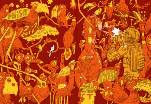
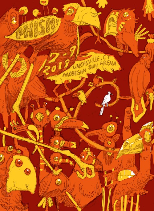
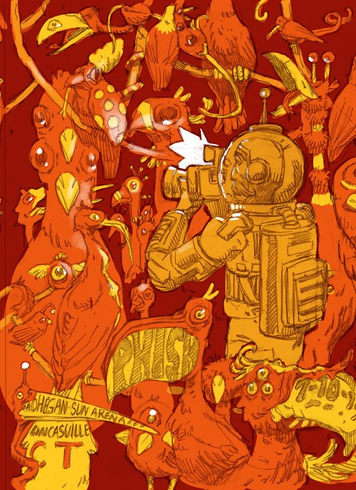
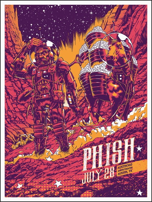
This concept was a continuation of a narrative that I created in 2015 for my first concert poster for Phish. In that poster, I showed an intergalactic cowboy and his spacesuit-clad horse mining fallen stars from the surface of an alien planet. For this new sketch, the same cowboy was still prospecting a far away world, but this time, he was birdwatching, and taking in the local fauna. One bird in particular is highlighted, with the cowboy’s binoculars fixed on its location. The art director selected it as the sketch to move forward.

12_2015Poster

My next step was to develop a rock solid drawing. Many years back, I was lucky enough to see a talk by Kali Ciesemier at The Society of Illustrators in New York, where something she said really stuck with me: that the key to a good illustration is a good drawing. As obvious as it seems now, what resonated with me about this advice was the realization that it never pays to be lazy when drawing, especially at the beginning. Consider the eraser your friend! If something doesn’t look right, get rid of it and start anew. 

13_FullDrawing

Keeping this lesson in mind, I tend to draw on Bristol paper when working through my drawings, as it can really take a beating with an eraser and not show it too much. Bristol paper is sold by a lot of different brands, at all different price points, but in my experience, the variation in quality between options is minimal. I didn’t have a sheet big enough to match the final size, so I taped two pieces of 12.25 x 15.5” Bristol together, making the entire canvas 25.5 x 15.5”. My preference is always to draw slightly smaller than printing size, as it saves me time when working through an elaborate drawing. 

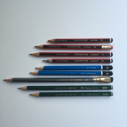
I almost always use Bic mechanical pencils when I draw. I buy them at the supermarket in bulk right after “Back to School” season and everything is on sale—$10 gets me a year’s supply. Their points are consistently and remarkably sharp, which makes them very conducive to detail-oriented work. I also find their erasers to be far sturdier than those on the typical pencil. The main downside to Bic mechanical pencils is that I’m certainly not helping the environment by using a disposable plastic pencil! My 2020 resolution is to invest in more permanent and durable mechanical pencil that I can continually refill. 

14_BicPencils

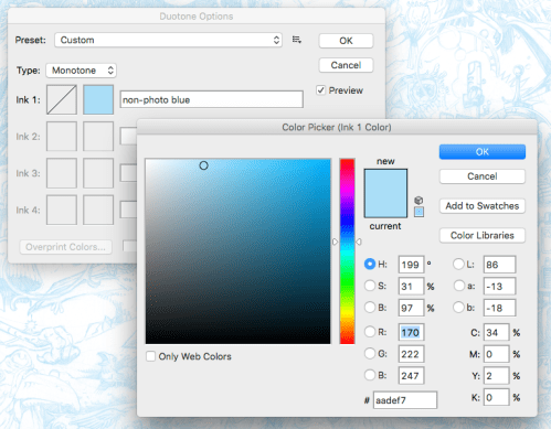
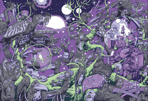
After the drawing is complete, I scan it with my HP Officejet 7610. It’s both a scanner and decent printer, and has been a reliable workhorse of mine since I bought it in 2012. Since the drawing is smaller than print size, I scan it in at 600dpi. I use my Wacom Intuos Pro tablet to clean problem areas in Photoshop; anything from proportional irregularities to eraser lines to typographic placement is fair game. When I’m happy with the drawing, I change its Color Mode from grayscale to duotone. The duotone color I use is a non-photo blue, for reasons I’ll outline a bit later on. Instructions for this step below:

15_ChangingColorMode16_ChangingColorMode217_ChangingColorMode3

After this I divided the drawing in half, and printed both halves on separate 11 x 17” pieces of Bristol paper. These two prints are pieced together with archival tape on the backside, revealing the full non-photo blue print of the drawing, and also the start of the inking phase. 

18_Materials

Illustrator Henry Pitz wrote in his 1957 book Ink Drawing Techniques that “no medium reveals its deepest secrets except to those who love it”—a feeling that couldn’t resonate more with me. To me, drawing is the battle, and inking is reaping the spoils of war. I find a quality of expression in inking that is unsurpassed. It’s my favorite stage of the whole process, one that I find calms my mind and leaves me oddly meditative.  

19_FullInks

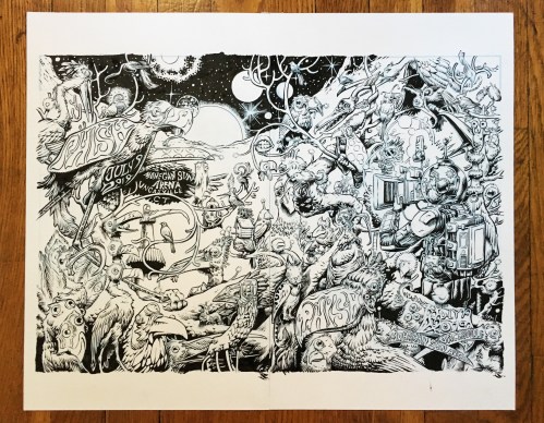
For these posters, the inking process took me about two and a half days of work. I prefer small brushes for the same reasons I work with mechanical pencils—they can get into tight corners and allow for a lot of detail-orientation and precision. When I ink something large like this, I tend to work in a rotating fashion, starting in a corner, inking a good chunk, and then spinning the paper around to work on another corner. The main purpose of this is to let the ink dry. It’s not uncommon for me to put my hand on wet ink, smudging a segment of the drawing, and rotating the canvas prevents that chance. Another concern I watch out for is prevents natural oils from getting on the paper. These natural oils will show up as fingerprints or palm prints in blacked out areas. It’s a small thing, but I try to prevent it to keep the illustration as pure and high contrast as possible.

Once the inking is completed, I scan it into my computer on grayscale mode at 600 dpi. This mode doesn’t pick up the non-photo blue and therefore the ink drawing is left isolated. The ink drawing is enlarged to print size, and coloring commences. With the amount of adjacent projects I had on the table, I chose to hire a colorist friend of mine, Meg Casey, to color flat the drawing: a process that includes blocking out the main shapes, coloring book style, within the drawing so that shading and color can be applied. Fortunately there was room in the budget for me to hire Meg, and it saved me a ton of time to work on other projects. When I received the flats back, they looked great.

20_MegsFlats

https://www.behance.net/megcasey

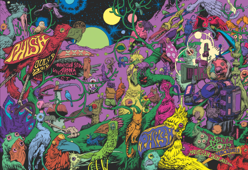
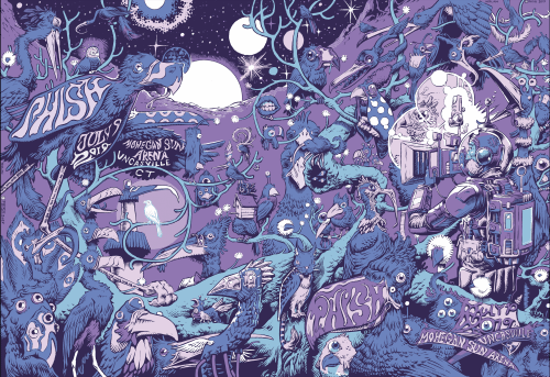
Finally, it was time to figure out coloring. The original sketch was a warm palette, with red, orange, and yellow, plus the white of the paper. After living with this combination for a couple days, I decided to reassess: I found it to be a bit of a strain on my eyes, and too close to my 2015 Phish poster palette as well. I wanted to mellow it down without sacrificing the psychedelic vibe that was achieved by three analogous hues. Intuition told me that a purple oriented palette was the right way to go, but it took me a few tries to get there. Remember, only 3-5 colors could be used since this would be screen printed. 

21_ColorAttempt122_ColorAttempt223_ColorAttempt3

The approved end result was 5 layers. The colors spanned from the deep, dark purple of the line work, to a sky blue that cuts through the purple like lightning. 

24_FinalResult25_FinalResult226_FinalResult3

Here’s how the isolated color palette looks.

27_FinalColorPalette

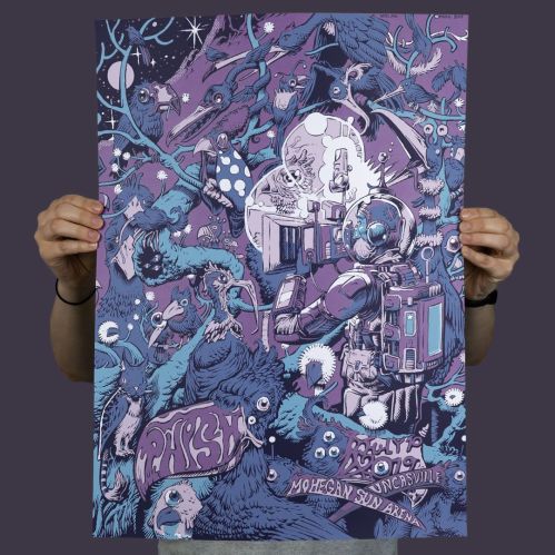
With the illustration completed, thus started a back and forth conversation with the very patient Half and Half printing. They received the final print file, and executed the necessary tweaks to get it ready for screen-printing before starting the process. A couple weeks later, the prints arrived, and the quality blew me away. Hats off to the wonderful people at Half and Half. They did impeccable work and I hope to collaborate with them again in the future. 

http://thehalfandhalf.com/printing/

The second to last step was to sign all of the posters. Vanity aside, this was no easy task with 1600 prints! Signing took me another three days, followed by packing the prints up again for transport. Luckily, the venue of the show was only an hours drive from my studio, so I was able to hand deliver the posters myself. 

So: one journey ends and many more await. Hopefully you enjoyed the ride, and gained some insight along the way. My process is personal and imperfect at times, but over my career I’ve learned to trust my instinct and do what works for me. Should you have any questions about any of these steps or my work, feel free to reach out at nolanillustration@gmail.com. 

Thanks to Rob for letting me take up valuable real estate on his blog. He’s a great artist, and a wonderful person. 

You can follow my work here:

Instagram: https://www.instagram.com/nolanillustration/

Twitter: https://twitter.com/conor_draws

Website: www.conornolan.com

Massive thanks to Conor for putting this post together for me to publish, I think he did an incredible job – of both the poster and the blog post. Conor’s work really is stunning, and he’s definitely an artist whose work I look out for on social media. Brilliant and inspirational. Do check out his links.

Thanks again Conor.

His Art Materials – 2019 update

I get asked a lot about what art materials I use for my drawings and illustrations. So here’s a blog post showing exactly what I have scattered around on my desk right now. If you aren’t familiar with the kind of stuff I draw, have a browse though the blog, or have a look at my work on Instagram or Facebook.

But first…

A good pencil won’t make you any better at drawing than that rubbish one you have in your pocket from a recent trip to Ikea. An expensive brush won’t instantly turn you in to the worlds best watercolourist. That watercolour pad you splashed out on, you know the one – hand made, 100% cotton, acid-free, cold pressed – isn’t going to make your drawings and paintings any better than if you were drawing on a Post-It note – unless you practice, unless you draw and draw and draw. New art materials are great, but they aren’t a short cut to being great at art, because there isn’t a short cut to being great at art. You just have to draw. Draw the stuff you love, draw the things you find difficult, set yourself some challenges, but most importantly just bloody well draw.

Now to the inky, graphitey stuff…

IMG_3488

Pencils (from top to bottom)

Staedtler Tradition, from 3H to 3B

Staedtler Mars Lumograph, 3H and 3B

Palomino Blackwing 602, not sure of the hardness – maybe a B?

Faber-Castell 9000, HB and 2B

IMG_6783

Mechanical Pencil

Pentel Graphgear 1000 0.7mm By far my favourite mechanical pencil to use.

IMG_3489

Technical Pens

Copic Multiliner SP, 0.03 to 0.7 thickness nibs (my favourite technical pens)

Rotring Tikky Graphic, 0.3 to 0.7

Staedtler Pigment Liner, 0.05 to 0.8

IMG_6780

Brush Pens and Nib Pens

Carbon Platinum

Kuretake Nib Holder and Kuretake G Pen nib

Pentel Pocket Brush

Kuretake No 8 Brush Pen


IMG_6782

Coloured Pens

Copic Ciao Markers (lots of them, particularly orange ones)

IMG_3493

Miscellaneous Pens

Edding Gold Paint Marker

Stabilo Point 88 Fineliner

Sharpie Twin Tip Marker

Sakura Gelly Roll Glaze Pen (opaque white)

Lamy Scribble Mechanical Pencil

IMG_3494

Bits and Pieces

Swann Morton Scalpel Blades, 10A

Swann Morton Scalpel

Steel Rule

Faber-Castell Eraser

Faber-Castell Sharpener

Cheap brush for clearing loose graphite or eraser bits

Toothbrush (an old one) for splattering paint or masking fluid

IMG_3495

Bottled Things

Higgins Black Magic Waterproof Ink

Kuretake Sumi Ink

Winsor & Newton Masking Fluid

IMG_3496

Paper

Goldline A3 Layout Pad (the big yellow one)

Daler Rowney A4 Tracing Pad (the grey one)

Daler Rowney A4 Smooth Heavy Weight Cartridge Pad (the pink one)

Daler Rowney A4 Bristol Board (the green one)

Daler Rowney A4 Fine Grain Heavy Weight Cartridge Pad (the brown one)

And also

A3 Minisun LED Lightbox – essential for tracing and refining sketches

Life-size human skull model – reference to die for

Caveat

As I said before, nothing on this blog post will make you draw any better, that’s up to you. Now, stop reading, and draw!


You can find prints of my work here

I also have a Patreon page

And you can find more of my work online…
Twitter
Instagram
Facebook
Tumblr

Buy Me a Coffee at ko-fi.com

FAQs

IMG_2427

I get quite a lot of comments on my posts on social media, and often people are asking me the same questions, so I thought I may as well answer a few of them here.

“Where can I find more of your work?”

I post regularly on social media, so find more of my illustrations on –
Instagram
Facebook
Tumblr
Twitter
Artstation

“Do you have a Patreon?”

Yes I do. On my Patreon page I’ll be building more of my Weird Field World of spaceships and alien technology. I’ll regularly post sketches, finishes illustrations, maps and charts, and even some written fiction. Supporting me gives you access to unseen work and gives you the opportunity to buy original art before anyone else, and also the chance to get involved with the world building of my Weird Field universe.

“What pen do you use?”

This is the question I get asked more than any other, and I know other illustrators get it a lot too. The first thing to say is – it isn’t about the pen. Yes you might get a bit of a difference in quality of line from pen to pen, obviously a brush pen gets you a different look to a pigment liner, but the pen doesn’t make you any better at drawing. The only way to get better at drawing – is to draw.

However, if you’re interested in the geekery of pens:

Copic Multiliner – 0.03 to 0.7 nibs
Rotring Tikky – 0.3 to 0.7 nibs
Pentel Pocket Brush
Kuretake No8 Brush Pen
Stabilo Point 88

Blackwing 602 pencil
Tombow Mono100 pencil
Steadtler Tradition HB pencil
Rotring Tikky mechanical pencil
Lamy Scribble mechanical pencil

Platinum Carbon fountain pen
Kuretake Zig Manga dip pen

Uni Posca White pen
Sharpies

Other kit…
Minisun A3 Lightbox

Sumi Ink 60
Winsor & Newton Masking Fluid
Daler Rowney A4 Cartridge paper
Moleskine A5 Sketchbook

“Where did you learn to draw?”

I was always the kid that drew, from as far back as I remember I was always drawing. When I was a little kid I used to sit in an armchair at home with a bit of wood across the arms, like a desk. I’d sit there and draw spaceships and monsters and dinosaurs and dragons for hours. Throughout all my school years, despite studying art, I don’t really recall being taught anything at all. Even at college (studying for a graphic design degree) I don’t think I got much in the way of tutoring. After college I barely drew at all for twenty years, since then all my progress has been through practice, and being inspired by all the great artists doing great work out there. One thing that has definitely helped since I started drawing again, has been daily drawing projects. For a whole year I drew a robot every day, and I’ve also taken part in the Inktober initiative for the last few years. Committing to drawing every day, even if it’s only for five or ten minutes, is a fantastic way to improve.

“Where do you get your ideas?”

Where aren’t there ideas? If you read books or comics, if you watch TV or film, if you look out of your window at home or school or work – there are ideas everywhere. You just have to look and let everything soak in. I get inspired by all kinds of things – looking at industrial buildings from the window of my train commute, the weird old oak trees in the park near my house. Films and books are a big influence – I’ve always been a sci-fi nerd so in my work you can see bits of Ralph McQuarrie, Jim Burns, Carlos Ezquerra, Cam KennedyJean Giraud and Enki Bilal.

“Why don’t you do a book?”

I’m working on a book. Slowly. It’ll be written and illustrated by me. Currently it’s about 75% written, but I’ve barely started thinking about the illustrations yet. So, nothing will be out for a while. There will definitely be a book at some point. And it will be about trolls. I have worked on illustrations for a couple of other books –  Build! A Knight’s Castle, and The Illustrated World of Mortal Engines (of which you can read more about here).

You can also find my work in Beginners Guide to Sketching: Robots, Vehicles and Sci-Fi ConceptsSketching From The Imagination: Sci-Fi, and Issue 2 of the brilliant Graphite Magazine.

“Where can I buy your work?”

You can buy prints of my work here. My good friend Jon Elliman runs Ellipress and has an amazing eye for detail and makes sure my prints look great.

If you would like to own some original artwork drop me a message on Twitter, Instagram or Facebook and let me know what you are interested in. There’s a little more information here.

Buy Me a Coffee at ko-fi.com

August blogfest – day 27

A few days ago I blogged about a couple of the pens on my desk at the moment (out of many dozen) and I promised another post on the same topic.

I’ve been using a couple of brush pens quite a bit recently, swapping between the two and comparing them. The first is the Pentel Pocket Brush, a cartridge based brush pen, with synthetic bristles. It’s quite a short pen, almost like an old fashioned fountain pen with a fat body. This does make it pretty comfortable to hold, and it’s a pen that feels good in your hand. The other pen I’ve been using is a Kuretake Fude Brush Pen No 8. Again this is a cartridge based pen with nylon bristles. It’s a slightly shorter brush than the Pentel, which makes it seem a little firmer to me and easier to control. The Kuretake has a much longer body than its rival, perhaps symbolic of Kuretake’s history of producing traditional Japanese Sumi brushes. For me the Kuretake is slightly better balanced, but it’s so close between the two pens it’s really whichever suits you.

In terms of ink there’s little to choose. Both pens have a good, deep, opaque black which covers really well. The Kuretake might be a hint warmer in colour, the Pentel drying to a slightly blue-black.

For me the one area where the Kuretake really wins is ink flow. It’s really easy to draw a fine and steady line of continuous ink with the No 8, whereas, for me, the Pocket Brush just tends to dry up or drag a little. If you like your brush strokes to have more character then you might actually prefer the Pentel for that reason.

Pens

Kuretake No 8 – top, Pentel Pocket Brush – bottom.

The other pen I’ve slightly fallen in love with recently, and it couldn’t be more different, is the Uni Posca PC-1MR white marker. Working predominantly in black ink on white paper, finding a decent white pen has proved really tricky. Recommendations have been found wanting on many occasions. White hybrid gel pens, Sakura Glaze pens – all a bit rubbish. What you need in a white pen, over pretty much everything else, is opacity. That’s what the Posca gives you in spades. I love it.

Posca

August blogfest – day 23

Books and pens

Books and pens

I’ve become a bit of a pen nerd recently. Well, I say recently, over the last couple of years. Tiger Pens, Cult Pens, and Amazon have been seeing way too much business from me. But, pens are the way I make my living, so it’s only fair that I indulge myself a little right?

My latest purchase – a recommendation I saw on Twitter from Will Freeborn, Ian McQue and Mack Chater – is a Carbon Platinum fountain pen. It’s nothing fancy, just a lightweight, standard fountain pen. The nib is great for sketching though, not too flexible, and the Platinum ink is a proper black. As Mack mentioned on Twitter, it does make a lovely noise on paper. That noise, that feel of a pen nib on the texture of paper is probably the reason I’ve got nowhere with digital art – it just doesn’t sound or feel the same.

Carbon

Carbon Platinum fountain pen

I’ve only used the Carbon Platinum fleetingly so far, but it does seem very good indeed. A pen I use all the time, and have done for a couple of years is the Copic Multiliner SP. I’ve got a whole range of nib thicknesses from 0.03mm to 0.7mm. It’s that range of line weights that allows me to add depth to my, otherwise very flat, illustrations.

Line weight

Line weights of Copic Multiliners

More pens tomorrow. As I said, I’m a bit of a pen nerd.

August blogfest – day 7

IMG_6846

Reinforcements arrive in the nick of time

I’ve been drawing with Palomino Blackwing pencils for most of this year. I’d thought they were just posh, over-priced, designery nonsense, but actually having tried them I bloody love using them. They are just great quality, simple as that. A much smoother graphite than I’ve found in any other pencils, and the wood sharpens beautifully. They are expensive, but for me they are worth it.

Today, I did order a couple of other high-end pencils to compare them with – a couple of Mitsubishi Hi-Uni HBs, and some of Tombow Mono 100s. I’ll post my thoughts when they arrive and I have chance to give them a go.

I used to always use a Swann Morton scalpel, with a 10A blade to sharpen my pencils, but as I’ve got busier I just use a sharpener as they’re so much quicker. When I was in London recently I went to L. Cornelissen & Son, a truly wonderful art shop in Bloomsbury, where I picked up a long point sharpener – and I love it.

IMG_6048

Just a smidgen of the loveliness that lay behind the doors of L. Cornelissen & Son.