Inktober 2018
It’s that time of year again where illustrators, artists, and other pen-and-ink wielding entities take part in Jake Parker‘s Inktober initiative.
Last year I only got as far as day eight. A combination of work, and my Inktober drawings being just too detailed and time-consuming meant that I couldn’t complete the project. I will come back to last year’s at some point though. I think Asteroid Belt Blues deserves an ending.
This year I’ve chosen British Folklore as my theme, and each day I’m drawing a creature or a character from some of the wonderfully weird tales we have on the British Isles. Many of the tales I’m drawing I’ve sourced from a couple of great books by Katherine Briggs – British Folk Tales and Legends, and The Fairies in Tradition and Literature. I started with the Lambton Worm, and today (day 18) I drew a Witch-Hare!
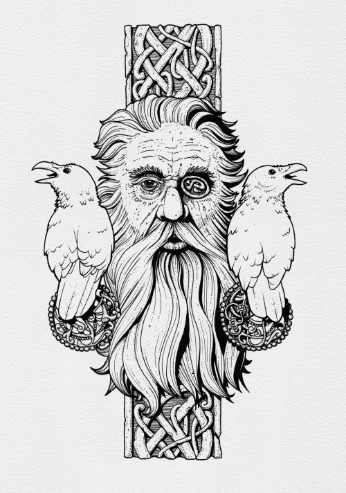
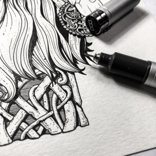
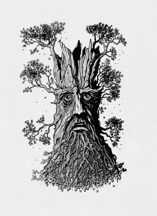
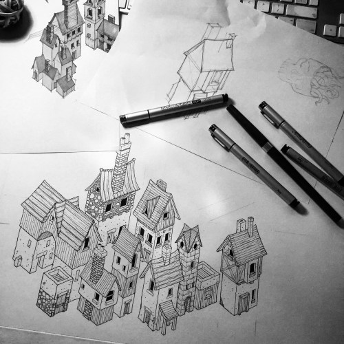
Below are all 16 illustrations from the first 17 days. Obviously doing a folklore theme there was no way I was doing anything on the 13th! Each illustration is drawn on A6 (105x148mm) cartridge paper, using Copic SP Multiliners and a Kuretake No.8 Brush Pen. Initial sketches are done with Palomino Blackwings and a Pentel Graphgear Mechanical Pencil.
-

- The Lambton Worm
-

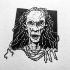
- A Screaming Skull
-

- Nelly Longarms
-

- Jack Frost
-
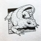
- The Alp Luachra
-

- A Red Cap
-
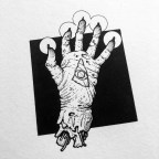
- A Hand of Glory
-
- Jenny Greenteeth
-

- The Loch Ness Monster
-
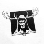
- Herne the Hunter
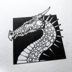
-
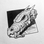
- The Knucker Hole Dragon
-

- A Hobgoblin
-

- The Black Hen
-
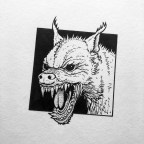
- The Barguest
-

- A Knocker
-
- A Wyvern
You can find prints of my work here
And you can find more of my work online…
Twitter
Instagram
Facebook
Tumblr
![]()