this northern boy

Illustrations for an imaginary age

Tag: illustration

August blogfest – day 23

Books and pens

Books and pens

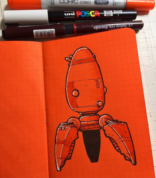
I’ve become a bit of a pen nerd recently. Well, I say recently, over the last couple of years. Tiger Pens, Cult Pens, and Amazon have been seeing way too much business from me. But, pens are the way I make my living, so it’s only fair that I indulge myself a little right?

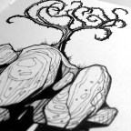
My latest purchase – a recommendation I saw on Twitter from Will Freeborn, Ian McQue and Mack Chater – is a Carbon Platinum fountain pen. It’s nothing fancy, just a lightweight, standard fountain pen. The nib is great for sketching though, not too flexible, and the Platinum ink is a proper black. As Mack mentioned on Twitter, it does make a lovely noise on paper. That noise, that feel of a pen nib on the texture of paper is probably the reason I’ve got nowhere with digital art – it just doesn’t sound or feel the same.

Carbon

Carbon Platinum fountain pen

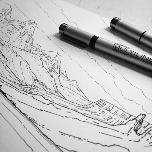
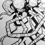
I’ve only used the Carbon Platinum fleetingly so far, but it does seem very good indeed. A pen I use all the time, and have done for a couple of years is the Copic Multiliner SP. I’ve got a whole range of nib thicknesses from 0.03mm to 0.7mm. It’s that range of line weights that allows me to add depth to my, otherwise very flat, illustrations.

Line weight

Line weights of Copic Multiliners

More pens tomorrow. As I said, I’m a bit of a pen nerd.

August blogfest – day 22

Today I’ve been working on some sketches for an article I’m writing about my methods/process for a new illustration magazine called Graphite. It’s a really nice little sci-fi brief, and having to write about how I approach it has meant I’m probably thinking about the way I’m working more closely. One of the elements of the illustration I’ve been thinking about in particular today is the composition, scribbling down little thumbnails, trying to work out an interesting layout. If I think about composition, I generally think about two artists  – Sergio Toppi and Mike Mignola. I’m going to come back to Mike in a later blog post, so here’s a little sample of some of Sergio Toppi’s amazing work.

Toppi’s composition is always striking, using dramatic contrasts of black and white, finding balance in seemingly impossible asymmetric layouts. I’m not sure there’s ever been a more masterful exponent of the art of composition and blimey, he could certainly draw.

August blogfest – day 20

Tired.

Caffeine induced insomnia kept me awake until gone 3am last night, so today has been a bit of a blur. I don’t drink caffeine, but every now and again, if I need a bit of a kick when I’m busy, I’ll have a proper coffee. I always regret it later when I’m wide awake in those quiet, small hours of the night.

I did manage to draw a nice little robot today though.

IMG_7164

Little orange robot

Drawn in a Field Notes Brand notebook, with Copic Multiliner, Copic Ciao Marker, Kuretake No8 brush pen and a white Posca marker.

August blogfest – day 18

In, and out of, my comfort zone.

I’m really still pretty new to illustration, I’ve been trying to make a living at it for just over a year, and been drawing seriously again for about three. There are lots of things I can’t draw – at least, there are lots of difficult things I avoid drawing. Like helicopters, or armoured Humvees. Today I’ve had to draw both of those, which was pretty challenging. I also had to draw some mountains, lots of mountains. Still quite challenging, but much more enjoyable.

IMG_7122

Armoured Humvee.

IMG_7129

Mountain range.

August blogfest – day 16

Virgil Finlay

Virgil Finlay was an American illustrator, specialising in super detailed pen-and-ink drawings with astonishing stippling and cross-hatching.

In his 35 year career Finlay created more than two and a half thousand illustrations, mainly for pulp science fiction, fantasy and horror magazines.

Have a look at some of his work… I think it’s absolutely incredible.

August blogfest – day 15

Halfway, almost. Blogging every day is actually tougher than I thought. Thinking up a new subject to blog about every day, tricky.

Today there’s a look at three quick little illustrations I’ve done in one of the lovely orange Field Notes notebooks I received recently. I rarely draw on coloured paper, so it’s a nice change, and also it’s cool to use a similar coloured marker to add a bit of subtle shading. A white Posca marker is great to add a few highlights or stars.

Is there anything you’d like me to blog about? Something about my work, processes, inspiration? Let me know in the comments. And thanks for sticking with me, 16 days to go.

IMG_6976

One-man flyer

IMG_6998

Little droid

IMG_7044

Orange freighter

IMG_7052

Field Notes special edition notebook

August blogfest – day 13

“Drawing is taking a line for a walk”, Paul Klee.


August blogfest – day 11

I’ve just decided that my stack of identically black, and identically plain Moleskines needed a little organising. Only a little. I wrote vague contents description on the covers and spines, so that’ll help a bit when I’m trying to remember where I drew something.

IMG_6934

Vaguely organised Moleskines.

I also made a little video of a leaf through one of those Moleskines…

The music is Drawn to the Blood, by Sufjan Stevens.

August blogfest – day 9

If you follow me on Instagram, or are a regular reader of this blog, you’ll know I have a thing for weird tentacled islands. There’s just something very cool about a seemingly idyllic little place – but underneath the ordinary facade there’s horror!

I did this sketch last night in my Moleskine using Rotring Tikky, Copic Multiliners and Kuretake No 8 brush pen, and there’s definitely a bit of influence from Notes from the Shadowed City – it’s a bit blacker and more angular than my typical stuff. As always, something like this is a lot of fun to draw.

Thorn-Tree

The Thorn Tree.

August blogfest – day 8

In the post today I received  a copy of Jeffrey Alan Love‘s Notes from the Shadowed City.

What a book. If you don’t know Jeffrey’s work have a look at his website – he creates incredibly bold, silhouette images of beautifully textured ink, occasionally there’s a dash of red, but for the most part they are black and white.

The book is the travelogue of a young man in search of magical swords. 70 pages of gorgeous illustrations and hand-written text make this an absolute visual feast.

I’m glad I pre-ordered as it meant my copy came with an original illustration and a signed numbered print. I really can’t recommend this enough. Stunning.