Inktober 2016
Every October, artists all over the world take on the InkTober drawing challenge by doing one ink drawing a day the entire month – Jake Parker.
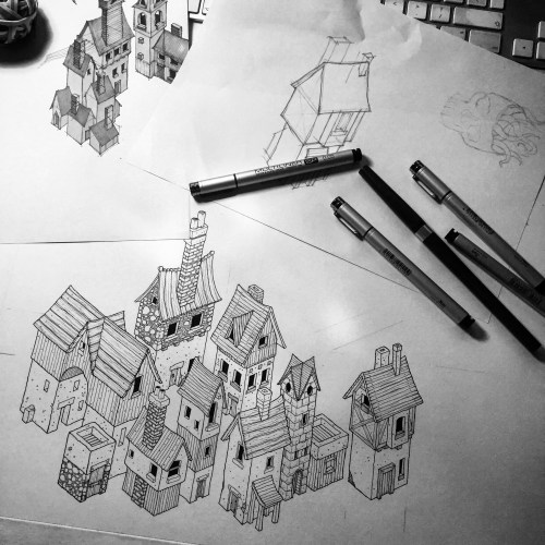
The village and associated sketches and thumbnails on my desk.
Inktober is a drawing challenge created by the illustrator Jake Parker, and this will be the third year I’ve taken part. In 2014 I just drew anything throughout the month with no real plan. Last year I drew anything in terms of subject, but I limited myself to using just one pen – a Pentel Pocket Brush. This year I’m doing something different again.
31³. 31 Days. 31 Drawings. £31 each.
Each day of October I’m going to draw one isometric building on A5, heavyweight, cartridge paper. The buildings will all be different, all drawn in ink, and will be black and white, and they’ll all be for sale – for just £31 each (including UK postage).
Some of the drawings will be simple medieval cottages, some may be churches or castles, watchtowers or turrets – I really don’t know yet and I’ll just draw whatever type of building I fancy that day.
The illustrations will be available as soon as they are posted on Instagram, so if you think you might be interested in buying one you’ll have to be following me there. Any unsold illustrations will go up on the blog as an end of Inktober sale.
I’ll be drawing each building on Daler Rowney cartridge paper, using Rotring Tikky and Copic Multiliner pens.
I can’t wait to get started.