this northern boy

Illustrations for an imaginary age

Tag: black and white

The Village

I’ve started a little side project, something to work on here and there between commissions, commercial work, and freelancing as a designer. It’s nice to have something on the go that I can draw with zero time pressure, or worrying about whether or not the client is going to like it.

So I’ve started an isometric drawing of a fantasy / medieval village. I haven’t really done any isometric stuff since I was at school, but it’s something I’ve always enjoyed seeing in other artists work. At college I discovered the work of Takenobu Igarashi, and not long afterwards I first saw the work of eBoy, entirely different artists but both working in that geometric, axonometric, 3D space. I’ve been a fan ever since.

The village is currently one sheet of A2 cartridge paper that I’m filling with little fantasy buildings, all aligned on a 30º plane. I’m going to fill the whole sheet and then after that, I might do some standalone illustrations.

It’s lots of fun so far, but I’d forgotten how complicated it can get drawing in an isometric view.

img_8100

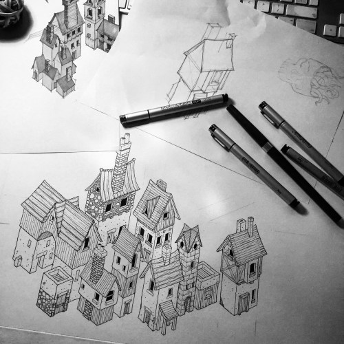
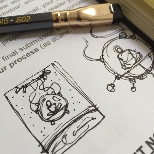
The village and associated sketches and thumbnails on my desk.

The Inspirational Art of Jared Muralt

covers

A growing Muralt collection.

Jared is primarily self-taught, and he developed his precision and skill through the careful study of books as diverse as those pertaining to anatomy, art history and comics. Muralt is co-founder of BlackYard studio, a Swiss illustration and graphic design studio.

That’s the simple text about the artist Jared Muralt that is printed on the belly bands of his two new sketchbooks, it barely tells you a thing about how astonishingly good an illustrator Jared is.

I first saw his work on Instagram, beautifully drawn images of angler fish, assortments of characters in period costume, floating ocean liners, and squadrons of WWII bombers. That precision, mentioned in the text above, really is one of Jared’s traits, but it comes with huge amounts of charm, and character, and interest. There’s nothing cold about the precise way he draws at all.

It would be easy, as an aspiring illustrator, to be daunted when you see the work of someone as accomplished as Jared, and to simply say – “I’ll never be as good as that”and throw your pencils away, but Jared’s sketchbooks, and his Instagram feed, really are testament to the value of practice. He draws a lot. He draws from life, out in the countryside sketching the mountains and meadows of Switzerland, he draws character studies fastidiously, practising the details from every angle. Rather than be daunted and overwhelmed, you should be inspired and enriched by his work. Stimulated to grab a sketchbook and draw.

If you draw or illustrate for a living, or just as a hobby, you really should buy one of Jared’s books. The sketchbooks are amazing, and Hellship is a wonderful graphic novel. The End of Bon Voyage is for me the real star, a magical, poignant, wordless story with the most beautiful drawings you can imagine.

In Jared’s new sketchbooks there’s one image in particular that grabbed me, this drawing of a man, curiously and noirishly lit. He looks like one of the characters from Fritz Lang’s ‘M’. Fantastically unsettling.

that-guy

Jared can be found on Instagram and on Twitter, and if you’d like to buy (you’d be mad not to) one of his books the BlackYard shop is here.

Buy Me a Coffee at ko-fi.com

August blogfest – day 27

A few days ago I blogged about a couple of the pens on my desk at the moment (out of many dozen) and I promised another post on the same topic.

I’ve been using a couple of brush pens quite a bit recently, swapping between the two and comparing them. The first is the Pentel Pocket Brush, a cartridge based brush pen, with synthetic bristles. It’s quite a short pen, almost like an old fashioned fountain pen with a fat body. This does make it pretty comfortable to hold, and it’s a pen that feels good in your hand. The other pen I’ve been using is a Kuretake Fude Brush Pen No 8. Again this is a cartridge based pen with nylon bristles. It’s a slightly shorter brush than the Pentel, which makes it seem a little firmer to me and easier to control. The Kuretake has a much longer body than its rival, perhaps symbolic of Kuretake’s history of producing traditional Japanese Sumi brushes. For me the Kuretake is slightly better balanced, but it’s so close between the two pens it’s really whichever suits you.

In terms of ink there’s little to choose. Both pens have a good, deep, opaque black which covers really well. The Kuretake might be a hint warmer in colour, the Pentel drying to a slightly blue-black.

For me the one area where the Kuretake really wins is ink flow. It’s really easy to draw a fine and steady line of continuous ink with the No 8, whereas, for me, the Pocket Brush just tends to dry up or drag a little. If you like your brush strokes to have more character then you might actually prefer the Pentel for that reason.

Pens

Kuretake No 8 – top, Pentel Pocket Brush – bottom.

The other pen I’ve slightly fallen in love with recently, and it couldn’t be more different, is the Uni Posca PC-1MR white marker. Working predominantly in black ink on white paper, finding a decent white pen has proved really tricky. Recommendations have been found wanting on many occasions. White hybrid gel pens, Sakura Glaze pens – all a bit rubbish. What you need in a white pen, over pretty much everything else, is opacity. That’s what the Posca gives you in spades. I love it.

Posca

August blogfest – day 26

“Regular maps have few surprises: their contour lines reveal where the Andes are, and are reasonably clear. More precious, though, are the unpublished maps we make ourselves, of our city, our place, our daily world, our life; those maps of our private world we use every day; here I was happy, in that place I left my coat behind after a party, that is where I met my love; I cried there once, I was heartsore; but felt better round the corner once I saw the hills of Fife across the Forth, things of that sort, our personal memories, that make the private tapestry of our lives.” Alexander McCall Smith.

IMG_7348

Mapping an imaginary place.

I drew this map for the episode artwork of the North v South podcast I make with Jon Elliman. Every week we have a topic, last night’s recording featured us discussing maps. We love a map. Doesn’t everyone?

August blogfest – day 24

Well, I almost forgot today, so this will be brief…

I’m working on an article for a new illustration magazine called Graphite at the moment. It’ll be a process type thing, showing how I work through a brief from initial thoughts and sketches to final, inked artwork. Today I finished the drawing stage so tomorrow it’ll be on to the inks.

Graphite magazine is published by the talented people at 3DTotal, and the first issue is out any day now.

IMG_7230

Scribbles on the brief

IMG_7247

Initial thumbnails

IMG_7253

Getting there with composition

August blogfest – day 22

Today I’ve been working on some sketches for an article I’m writing about my methods/process for a new illustration magazine called Graphite. It’s a really nice little sci-fi brief, and having to write about how I approach it has meant I’m probably thinking about the way I’m working more closely. One of the elements of the illustration I’ve been thinking about in particular today is the composition, scribbling down little thumbnails, trying to work out an interesting layout. If I think about composition, I generally think about two artists  – Sergio Toppi and Mike Mignola. I’m going to come back to Mike in a later blog post, so here’s a little sample of some of Sergio Toppi’s amazing work.

Toppi’s composition is always striking, using dramatic contrasts of black and white, finding balance in seemingly impossible asymmetric layouts. I’m not sure there’s ever been a more masterful exponent of the art of composition and blimey, he could certainly draw.

August blogfest – day 16

Virgil Finlay

Virgil Finlay was an American illustrator, specialising in super detailed pen-and-ink drawings with astonishing stippling and cross-hatching.

In his 35 year career Finlay created more than two and a half thousand illustrations, mainly for pulp science fiction, fantasy and horror magazines.

Have a look at some of his work… I think it’s absolutely incredible.

August blogfest – day 13

“Drawing is taking a line for a walk”, Paul Klee.


August blogfest – day 11

I’ve just decided that my stack of identically black, and identically plain Moleskines needed a little organising. Only a little. I wrote vague contents description on the covers and spines, so that’ll help a bit when I’m trying to remember where I drew something.

IMG_6934

Vaguely organised Moleskines.

I also made a little video of a leaf through one of those Moleskines…

The music is Drawn to the Blood, by Sufjan Stevens.

August blogfest – day 9

If you follow me on Instagram, or are a regular reader of this blog, you’ll know I have a thing for weird tentacled islands. There’s just something very cool about a seemingly idyllic little place – but underneath the ordinary facade there’s horror!

I did this sketch last night in my Moleskine using Rotring Tikky, Copic Multiliners and Kuretake No 8 brush pen, and there’s definitely a bit of influence from Notes from the Shadowed City – it’s a bit blacker and more angular than my typical stuff. As always, something like this is a lot of fun to draw.

Thorn-Tree

The Thorn Tree.