I’m spending a couple of weeks relaxing in the sun. Which although incredibly lovely, isn’t that conducive to drawing. It’s a bit too warm – sweating palms and all that. I have managed to put the sketch book to a little use today though.
After an amazing sunset last night, with big backlit thunderheads piling up in front of the sun on the horizon, I was inspired to do a little doodle…
I’m heading off for a holiday, so blog posts may be infrequent/nonexistent for the next couple of weeks. I am taking a sketchbook and a small selection of pencils and pens – so hopefully when I return there may be a blog update with a slightly tropical feel.
It was pointed out to me that Doodle Street was missing a few crucial amenities. Notably a flower shop, a pie shop, and of course a pub.
This oversight has now been rectified.
I’ve taken to carrying a sketchbook with me over the last few months, particularly if I’ve been working at a client’s office. It’s nice to get out on a lunchtime and doodle while I have a bite to eat.
This landscape is the product of a few lunchtimes in a pub by the Thames. It began as nothing but a doodle of a rock…
It took a couple of days, but only an hour or so of actual drawing, for it to progress into a landscape…
The final drawing. Could be the lake district, or possibly somewhere east of the Shire in Middle Earth.
UPDATE:
I’ve realised that this drawing reminds me of the drawings of the British walking book author Alfred Wainwright. His Pictorial Guides to the Lakeland Fells are full of beautiful renderings of the Lake District.
Doodles often end up being much more, which is sometimes a problem if I’ve started doodling on a scrap of paper, or if I’m simply sketching in a corner of another drawing. However, yesterday, my doodle simply evolved to fill the space available.
I began scribbling the beginnings of a house on a folded piece of paper I was using to keep another drawing clean while I worked.
I quite liked where it was going, so I carried on, and on. Eventually filling the space I had with half a street’s worth of buildings.
I added some background, and extended the street with a little tudor building to the left, worked in a bit more detail and the pen work was finished, just the colouring was left.
I use photoshop to colour my drawings, using multiple layers to build up the colour and detail. The final version of Doodle Street has over 80 of these layers. To show how this builds up into a final illustration I made a process movie…
The final image is shown below…
I woke up a few mornings ago with a vague thought in my head about a dragon coiled around a hill, and I thought it would make a fun illustration. I knew it was a folk story from England but couldn’t recall anymore. As soon as I was at my desk a quick search on wikipedia filled in the rest.
The Lambton Worm is a story from the northeast of England about young John Lambton who skips church one day to go fishing. He catches a lamprey, but can’t be bothered to carry it home so he throws it down a well. Years later John returns from the crusades to find the lamprey has become a monster terrorising his father’s estate. The worm is now so large it can wrap itself seven times around the nearby Penshaw Hill. With the advice of a witch, John Lambton eventually slays the worm, but at a terrible price.
I love English folk tales, so I started to sketch out some ideas of how this worm might look. In the song the worm…
An’ grewed an aaful size;
He’d greet big teeth, a greet big gob,
An greet big goggly eyes.
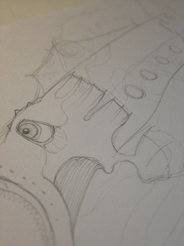
…so I had something to go on. I wanted to keep something of the lamprey about the creature too, so it was definitely going to be eel-like with the distinctive lamprey gill pores along its side. My first sketches weren’t promising though.
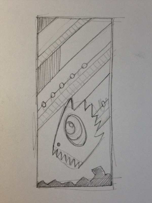
I decided that rather than try to depict the entire beast, in a fight with John Lambton, or coiled around Penshaw Hill, I’d use a more graphic composition.
Happy with this, and with the more stylised version of the worm, I worked on a detailed pen drawing. Even though there are lots of straight lines, I shy away from using a ruler as it just gives too sharp a line. Drawing freehand creates a bit more character, and with a bit of practice you can do pretty well without the ruler. The patterned background allows the worm itself to stand out, ready for colour.
Colouring the worm was reasonably simple using Photoshop. The colour palette was always going to be a dark aqua-ish background with a much more vivid worm. The shading and patterns were built up layer by layer, about 30 layers in total, the eye alone having over a dozen layers.
I’m pleased with the final result, and I think it’ll be the first in a series of three or four illustrations of English folk tales. Next, either Jack in Irons, Recdcap, or Peg Pawler!
I have a thing about drawing fish. I’m not afraid to admit it. It’s not my fault, it’s all Ian Miller‘s fault. When I was a kid I loved looking at the illustrations he’d done for comics and graphic novels, but it was his work in a book called The Guide To Fantasy Art Techniques that really got my attention.
The book featured eight fantasy or science fiction artists and illustrators, showing some of their work and getting an insight into how they went about producing these amazing images.
The chapter on Ian Miller had a profound effect on my drawings for years to come. His work is described in the book…
Delicacy of line and intricacy of detail typically characterise Ian Miller’s work, though his subject matter and technique often vary greatly. Equally at home with complex machinery or living creatures of various guises, his illustrations range from loose figure sketches in pencil and charcoal to pen and ink drawings of complex artefacts, twisted trees or winged insects.
Armed with an expensive handful of Rotring pens I set about mimicking Ian Miller’s style. I drew insects, fish, even a self portrait for college in his super-detailed and nightmarish style. Eventually my work became more personal, but I was left with a love of drawing fish and deep-sea creatures.
The picture here is from my time at art college in Cumbria. We were told by an illustration tutor that it wasn’t possible to produce a decent illustration using Rotring pens, and that real illustrators used dip or quill pens. Well, that was a challenge right there, so using nothing but a couple of those lovely burgundy Rapidographs I drew the Big Fish, Small Ship. Eighteen years later I’m still happy that it’s a decent bit of work. Although, for some reason I never wrote the title in the box I’d left for it.
A few days ago I was idly doodling, probably while I was supposed to be doing something else, and I ended up with the beginnings of a medieval town. I worked on it for a couple more hours, and was pretty pleased. It’s wonky as hell, but it’s interesting I think.
So I liked this, but it really was a bit slap-dash. So I decided to have another go at it, taking a bit more care and time. Over the next few days the drawing progressed…
I think it manages to keep the same feel as the first sketch, but it’s better balanced and more considered. I think maybe an extra layer of buildings could have worked, maybe next time.
The last thing I did was to have a go at colouring it. I’ve never used photoshop to colour one of my sketches before, so this was a bit hit and miss. I’m sure I went about it in an entirely inefficient way, but the result was OK. I like the colour palette, I’d like to get more texture into the next one though.
So that’s The City & The Castle complete.