this northern boy

Illustrations for an imaginary age

Category: art

The Inspirational Art of Jared Muralt

covers

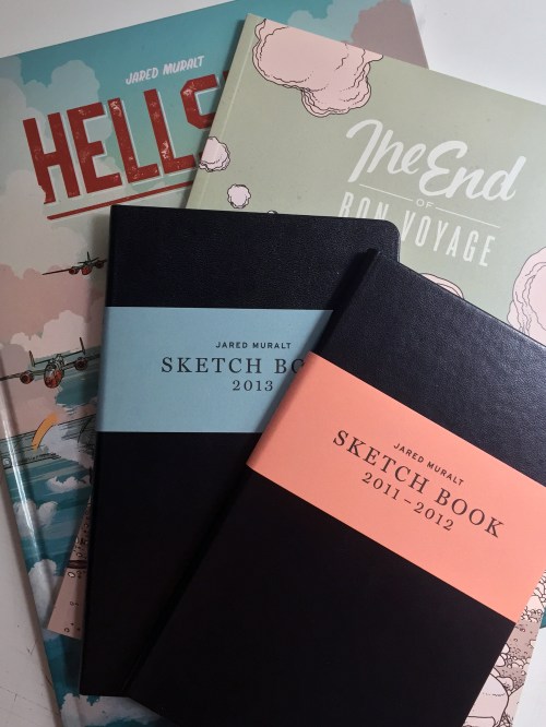
A growing Muralt collection.

Jared is primarily self-taught, and he developed his precision and skill through the careful study of books as diverse as those pertaining to anatomy, art history and comics. Muralt is co-founder of BlackYard studio, a Swiss illustration and graphic design studio.

That’s the simple text about the artist Jared Muralt that is printed on the belly bands of his two new sketchbooks, it barely tells you a thing about how astonishingly good an illustrator Jared is.

I first saw his work on Instagram, beautifully drawn images of angler fish, assortments of characters in period costume, floating ocean liners, and squadrons of WWII bombers. That precision, mentioned in the text above, really is one of Jared’s traits, but it comes with huge amounts of charm, and character, and interest. There’s nothing cold about the precise way he draws at all.

It would be easy, as an aspiring illustrator, to be daunted when you see the work of someone as accomplished as Jared, and to simply say – “I’ll never be as good as that”and throw your pencils away, but Jared’s sketchbooks, and his Instagram feed, really are testament to the value of practice. He draws a lot. He draws from life, out in the countryside sketching the mountains and meadows of Switzerland, he draws character studies fastidiously, practising the details from every angle. Rather than be daunted and overwhelmed, you should be inspired and enriched by his work. Stimulated to grab a sketchbook and draw.

If you draw or illustrate for a living, or just as a hobby, you really should buy one of Jared’s books. The sketchbooks are amazing, and Hellship is a wonderful graphic novel. The End of Bon Voyage is for me the real star, a magical, poignant, wordless story with the most beautiful drawings you can imagine.

In Jared’s new sketchbooks there’s one image in particular that grabbed me, this drawing of a man, curiously and noirishly lit. He looks like one of the characters from Fritz Lang’s ‘M’. Fantastically unsettling.

that-guy

Jared can be found on Instagram and on Twitter, and if you’d like to buy (you’d be mad not to) one of his books the BlackYard shop is here.

Buy Me a Coffee at ko-fi.com

August blogfest – day 31

It’s finally over! At the beginning of August I wrote that I might be making a rod for my own back by committing to one blog post a day for the month. I was right. I really enjoy writing my blogs, but I tend to write and post them when I feel I have something to share or something to say. Finding the time, and a subject every day was a real struggle. Far too many of the posts have been written hurriedly at eleven o’clock at night. I definitely think I write better with a little more time – both to do the actual writing, and to think about the subject.

How was it for you? Did you enjoy reading a new post everyday? Were the subjects interesting? Was the content too image heavy? Too wordy? In the future are there particular subjects you might like to read about? I’d be very interested to know your thoughts, so please add a comment if you have time.

In terms of stats, blogging every day didn’t have much affect. I had just over 1400 visitors in August, compared to 1100 in July. A little up on my average of 930 each month so far this year. Likes, comments and new subscribers were about the same as previous months too. I think previous posts, where I’ve written in a little more depth about a topic, or had the time to put together lots of images, have definitely had better responses and have been shared more widely on social media. Which I think suggests that it’s all about quality rather than quantity.

Next month I’ll revert to posting three of four times, and I’ll try to make sure they are a little more detailed and considered.

Thanks for reading, if you are still reading and haven’t nodded off by now, and please do add a comment when you get a chance.

Goodbye August. Hello September.

August blogfest – day 30

I’ve just finished an illustration for an article for Graphite magazine, it’s for an article on my process. Less a ‘how to’ more of a ‘how I do it’ kind of thing. Having to document my methods really makes me think about how I work, and if I can improve things.

Here are a few thoughts:

  1. Use photoshop to tweak, adjust and mock up layouts from my own sketches. Sometimes I can spend a day making minor adjustments to layouts, sizes of elements etc, using photoshop to adjust my notebook sketches and create rough mock ups of the illustration could save me time.
  2. Get a lightbox. With a mock up of the illustration printed out, I could use a lightbox to take this straight to a final drawing stage. Usually I sketch, scan, print out, trace, transfer… Using a lightbox could really save me time.
  3. Get the drawing right. It’s much easier to ink if you’re drawing is correct, and very difficult to cope with or correct if it’s not.
  4. Tangents. Tangents – where two or more lines, corners, or elements intersect or touch in a way that distracts or confuse – really need to be avoided. Even though I know this rule I often find it hard to avoid. Or maybe I’m just being lazy with the drawing. I should take more time to make sure I get rid of these by redrawing or adjusting the layout.
  5. Life drawing. I really need to take a life drawing course, there’s simply no way of avoiding the fact that I’m terrible at drawing people – and it’s just down to lack of practice.
  6. Continue to develop a visual style and language. Most of my illustrations are recognisably mine, people can tell a spaceship I’ve drawn from one drawn by someone else pretty easily. It’s no good just standing still with a style though, I need to continue to push myself to develop.
  7. Build a visual dictionary. I need to build up a bank of knowledge about stuff that crops up in my illustrations. Pinterest is a great help for this but I tend to be a little lazy with it. I should create a few boards on subjects such as aeronautical engineering, space machinery, submersibles, robotics… The more stuff I have in that visual dictionary the better.


August blogfest – day 28

Everything I know about art (or did at the age of 15)

When I was a kid my mum enrolled on an Open University Course in the History of Art. One of the books that appeared on the bookshelves as a result was E.H. Gombrich’s The Story of Art. For a good eight or nine years, pretty much everything I knew about art came out of that book. My current copy is the third I’ve owned, and it’s still pretty indispensable.

IMG_7438

The Story of Art, first published in 1950 (and updated regularly since) is a fantastic introduction to the world of art, from prehistoric cave paintings to modern art, Gombrich discusses the development or art, painting, sculpture, and architecture. It really is an invaluable resource – even in the age of the internet, and if you want to learn something about art, particularly in a broad sense, it’s hard to beat.

For me the Story of Art was a real introduction to renaissance art – Bernini, Titian, Bellini, Bosch, Van Eyck, Dürer, Holbein… The first time I saw many of the works of these artists was in the book, and it wasn’t until decades later I saw some of them in real life.

Years later when I was studying Art A Level, my teacher would read sections of The Story of Art to us, I think this was the history of art element of the A Level in its entirety. The thing was the teacher wasn’t really very good at pronunciation – so when she was reading sections on classical art, it was kind of hilarious. Heracles, became Herrackles, Hermes became Herms, Praxiteles became Pracsittles… Some things are just beyond the scope of Gombrich’s influence it seems.


August blogfest – day 27

A few days ago I blogged about a couple of the pens on my desk at the moment (out of many dozen) and I promised another post on the same topic.

I’ve been using a couple of brush pens quite a bit recently, swapping between the two and comparing them. The first is the Pentel Pocket Brush, a cartridge based brush pen, with synthetic bristles. It’s quite a short pen, almost like an old fashioned fountain pen with a fat body. This does make it pretty comfortable to hold, and it’s a pen that feels good in your hand. The other pen I’ve been using is a Kuretake Fude Brush Pen No 8. Again this is a cartridge based pen with nylon bristles. It’s a slightly shorter brush than the Pentel, which makes it seem a little firmer to me and easier to control. The Kuretake has a much longer body than its rival, perhaps symbolic of Kuretake’s history of producing traditional Japanese Sumi brushes. For me the Kuretake is slightly better balanced, but it’s so close between the two pens it’s really whichever suits you.

In terms of ink there’s little to choose. Both pens have a good, deep, opaque black which covers really well. The Kuretake might be a hint warmer in colour, the Pentel drying to a slightly blue-black.

For me the one area where the Kuretake really wins is ink flow. It’s really easy to draw a fine and steady line of continuous ink with the No 8, whereas, for me, the Pocket Brush just tends to dry up or drag a little. If you like your brush strokes to have more character then you might actually prefer the Pentel for that reason.

Pens

Kuretake No 8 – top, Pentel Pocket Brush – bottom.

The other pen I’ve slightly fallen in love with recently, and it couldn’t be more different, is the Uni Posca PC-1MR white marker. Working predominantly in black ink on white paper, finding a decent white pen has proved really tricky. Recommendations have been found wanting on many occasions. White hybrid gel pens, Sakura Glaze pens – all a bit rubbish. What you need in a white pen, over pretty much everything else, is opacity. That’s what the Posca gives you in spades. I love it.

Posca

August blogfest – day 26

“Regular maps have few surprises: their contour lines reveal where the Andes are, and are reasonably clear. More precious, though, are the unpublished maps we make ourselves, of our city, our place, our daily world, our life; those maps of our private world we use every day; here I was happy, in that place I left my coat behind after a party, that is where I met my love; I cried there once, I was heartsore; but felt better round the corner once I saw the hills of Fife across the Forth, things of that sort, our personal memories, that make the private tapestry of our lives.” Alexander McCall Smith.

IMG_7348

Mapping an imaginary place.

I drew this map for the episode artwork of the North v South podcast I make with Jon Elliman. Every week we have a topic, last night’s recording featured us discussing maps. We love a map. Doesn’t everyone?

August blogfest – day 22

Today I’ve been working on some sketches for an article I’m writing about my methods/process for a new illustration magazine called Graphite. It’s a really nice little sci-fi brief, and having to write about how I approach it has meant I’m probably thinking about the way I’m working more closely. One of the elements of the illustration I’ve been thinking about in particular today is the composition, scribbling down little thumbnails, trying to work out an interesting layout. If I think about composition, I generally think about two artists  – Sergio Toppi and Mike Mignola. I’m going to come back to Mike in a later blog post, so here’s a little sample of some of Sergio Toppi’s amazing work.

Toppi’s composition is always striking, using dramatic contrasts of black and white, finding balance in seemingly impossible asymmetric layouts. I’m not sure there’s ever been a more masterful exponent of the art of composition and blimey, he could certainly draw.

August blogfest – day 20

Tired.

Caffeine induced insomnia kept me awake until gone 3am last night, so today has been a bit of a blur. I don’t drink caffeine, but every now and again, if I need a bit of a kick when I’m busy, I’ll have a proper coffee. I always regret it later when I’m wide awake in those quiet, small hours of the night.

I did manage to draw a nice little robot today though.

IMG_7164

Little orange robot

Drawn in a Field Notes Brand notebook, with Copic Multiliner, Copic Ciao Marker, Kuretake No8 brush pen and a white Posca marker.

August blogfest – day 17

A busy one.

I’m still working on sketches and final inked illustrations for the client in California, feedback has meant a few changes – and the addition of helicopters! Not something I’m used to drawing, Google coming in very handy.

I’m also working on the branding project, again feedback has come in so I have a few amends to make before I get stage two over to the client.

Good to be busy though.

As I haven’t had time to write a more interesting blogpost today, I’ll just leave you with my favourite painting, if you’re ever in London drop in to the National Gallery and stand in front of it for a few minutes. It’s a treat for the eyeballs.


Whistlejacket_by_George_Stubbs_edit

Whistlejacket, painted in 1762, by George Stubbs.

August blogfest – day 16

Virgil Finlay

Virgil Finlay was an American illustrator, specialising in super detailed pen-and-ink drawings with astonishing stippling and cross-hatching.

In his 35 year career Finlay created more than two and a half thousand illustrations, mainly for pulp science fiction, fantasy and horror magazines.

Have a look at some of his work… I think it’s absolutely incredible.